Responsive Image Gallery for WordPress
Create a mobile-friendly responsive image gallery in WordPress with FooGallery’s default gallery layout.
Default FooGallery layout for responsive image galleries.
Built for mobile-friendly presentation.
Customize the gallery to match your website.

Free included
100K active installs
4.8 / 5 rating
980+ reviews
Live demo
Responsive Image Gallery for WordPress Demo
Use the demo below to see how the Responsive Image Gallery works.


Interact with the gallery above to evaluate the responsive layout. Adjust your browser size to mobile.
Who this is for?
For sites where galleries must work on every screen.
Use the responsive gallery when visitors need a clean image grid on desktop, tablet, and mobile.
- Site ownersPublish a reliable gallery without writing layout CSS for different devices.
- BloggersAdd photo sets to posts and resource pages that stay easy to browse on phones.
- Small businessesShow projects, products, events, or locations with a simple gallery that adapts automatically.
Availability
FooGallery Free includes this feature.
This feature is available in FooGallery Free, and every paid plan includes it too.
Included
Free
FooGallery Free includes this feature.
Also included
PRO Starter
PRO Starter includes all Free features.
Also included
PRO Expert
PRO Expert includes all PRO Starter features.
Also included
PRO Commerce
PRO Commerce includes all PRO Expert features.
Ready for the next step?
Read through the relevant documentation or download to immediately get started
Upgrade path
Compare Related FooGallery Features
Check out these related FooGallery features to improve your WordPress galleries
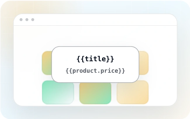
Animated Hover Effect Presets
FooGallery Pro Starter comes with a selection of pre-styled hover effects. These unique hover presets save you from having to style your own and add a unique style to your galleries.
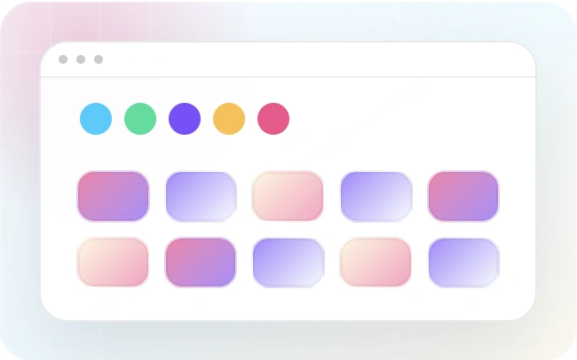
Color Sorting
Sort gallery images by dominant colors and add tinted backgrounds.
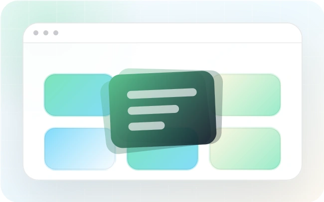
Custom Captions
Are you looking for a quick way to add custom captions? FooGallery PRO Expert allows you to add custom captions to images inside your WordPress galleries.
FAQs
Frequently Asked Questions
Answers to common questions about responsive image galleries in WordPress.
It is a mobile-friendly image gallery that adapts to the screen size or device that the visitor is using. This is usually done through rules within the CSS stylesheets. A gallery that claims to be responsive should be able to handle both mobile and desktop displays, adjusting the gallery layout to fit the screen size from which it is being viewed. The Responsive Layout is the default gallery layout in FooGallery.
Yes, FooGallery Free includes the responsive layout. Download FooGallery Free to start using this feature, then compare PRO plans when you need advanced controls.
Yes, there are tons of settings to customize the look and feel of your responsive gallery, including borders, theme, hover effects, captions, as well as thumbnail sizes, thumbnail gaps and more. You can also adjust the lightbox settings.
When you need more features or advanced customisations. FooGallery PRO Starter comes with more layouts (all responsive), hover effect presets and thumbnail effects. If you want to display dynamic galleries or videos then choose PRO Expert. If you want to add watermarks or sell images with WooCommerce, then PRO Commerce is the right choice.
Start with FooGallery free
Build this gallery with FooGallery Free
Responsive Image Gallery for WordPress is available in FooGallery Free. Install the plugin when the demo matches your site, then upgrade when you need more advanced controls.