CSS hover effects take 20+ lines of code to get right – and they break on mobile if you’re not careful. We’ve spent 10+ years building FooGallery, a free WordPress gallery plugin used on 100,000+ sites, so we know which hover effects actually get clicked on. Here are 13 that work, with code you can copy today, plus a no-code option if you’d rather skip the CSS entirely!
Not a fan of coding battles? No worries! WordPress warriors can skip the CSS showdown entirely with FooGallery – your trusty sidekick that delivers these same eye-popping effects through a few simple clicks. Check out our guide on WordPress image hover effect if you want to explore further this no-code approach.
Let’s dive in and start bringing your images to life!
Which Hover Effect Should I Use?
| # | Effect Name | Best For | CSS Dificulty | Mobile Safe? | FooGallery Supported? |
|---|---|---|---|---|---|
| 1. | Opacity Change | Quick visual feedback to encourage clicks (low distraction browsing) | Easy | Yes | Free |
| 2. | Color Overlay | Drive clicks on branded CTAs or category navigation | Medium | Yes | Free |
| 3. | Scale Effect | Highlight key products or images to guide user focus before clicking | Easy | Partial | Free |
| 4. | Rotate Effect | Draw attention to featured or playful elements (novelty over clarity) | Medium | No | Pro |
| 5. | Border Addition | Indicate selection or hover state in grid layouts (compare multiple items) | Easy | Yes | No |
| 6. | Shadow Effect | Emphasize clickable cards or elevate priority items | Easy | Yes | Free |
| 7. | Blur Effect | Shift focus to overlay text or actions (read before click) | Medium | Partial | No |
| 8. | Flip Effect | Reveal secondary info (compare front vs back content) | Hard | No | Free |
| 9. | Brightness Adjustment | Subtle emphasis on hover without distracting from browsing flow | Easy | Yes | Free |
| 10. | Slide Effect | Reveal hidden CTAs or metadata (encourage deeper interaction) | Medium | Partial | Free |
| 11. | Text Pop-Up | Show extra details without clutter (explore before clicking) | Medium | Partial | Free |
| 12. | Grayscale to Color | Create visual contrast to highlight important items (attention focus) | Easy | Yes | Free |
| 13. | Square to Circle | Highlight avatars or key items (visual differentiation in grids) | Easy | Yes | No |
How to Create Easy Image Hover Effects with CSS
CSS (Cascading Style Sheets) provides web developers with powerful tools to create engaging hover effects without relying on JavaScript or plugins. The :hover pseudo-class allows you to implement eye-catching animations that activate when a visitor moves their cursor over an image.
With just a few CSS properties like transition, transform, and opacity, you can create professional animations that:
- Load quickly and work across most modern browsers.
- Don’t require external dependencies or additional HTTP requests.
- Give you precise control over timing and visual effects.
- Keep your site lightweight and responsive.
For each of the 13 effects, you will learn:
- The exact CSS code needed for implementation.
- How to target specific elements using class selectors.
- The key CSS properties that create the animation.
- How to customize the timing and intensity of the effect.
If you’re a WordPress user but still want the flexibility of custom code, you can easily add these CSS snippets to your theme’s stylesheet or use the WordPress Customizer.
1. Opacity Change
The opacity change effect is one of the simplest yet most effective hover effects you can apply to your images. This effect makes an image appear faded or translucent by default, then become fully opaque when the user hovers over it. It’s an excellent way to draw attention to images and create a sense of interactivity.
Here’s how you can implement the opacity change effect:
.image-container {
  opacity: 0.1;
  transition: opacity 0.3s ease;
}

.image-container:hover {
  opacity: 1;
}Code language: CSS (css)
In this example, the image starts with semi opacity and becomes fully-opaque on hover. The transition property ensures a smooth change, enhancing the user experience. Here it is in action:
2. Color Overlay
Want to make your images more vibrant on hover? A color overlay effect is just the trick! This technique adds a translucent layer of color over your image when a user hovers, creating a striking visual transformation.
For this effect, you’ll need to have your image inside a container like a div, which is where you’ll apply a translucent background color for the effect. Here’s how to paint your images with a hover:
.image-container {
  position: relative;
}

.image-container img {
  display: block;
}

.image-container:hover::after {
  opacity: 1;
}

.image-container::after {
  content: "";
  position: absolute;
  top: 0;
  left: 0;
  right: 0;
  bottom: 0;
  background-color: rgba(255, 182, 193, 0.5);
  opacity: 0;
  transition: opacity 0.3s ease;
}Code language: CSS (css)
This CSS creates a semi-transparent color overlay that fades in when the user hovers over the image. You can adjust the color and opacity to suit your design needs. Here’s what that would look like:
3. Scale Effect
The scale effect creates an illusion of the image growing or zooming in when hovered over. It’s a subtle yet powerful way to draw attention to specific images.
Try this code snippet to smoothly scale the image to 110% of its original size on hover:
.image-container img {

    transition: transform 0.3s ease-in-out;

}

.image-container:hover img {

    transform: scale(1.1); /* Increases size by 10% */

}Code language: CSS (css)
When implementing scale effects, be mindful of your layout. Ensure that the enlarged image doesn’t overlap with other important elements on your page. Witness the magic in motion:
4. Rotate Effect
The rotate effect adds a dynamic twist to your images, literally. When a user hovers over the image, it rotates to a specified degree, creating an eye-catching animation.
.rotate-image {

    transition: transform 0.3s ease-in-out;

}

.rotate-image:hover {

    transform: rotate(15deg);

}Code language: CSS (css)
In this example, the image rotates 15 degrees clockwise on hover. You can adjust the degree value to increase or decrease the rotation. For a counter-clockwise rotation, use a negative value. Check it out for yourself:
💡 Pro tip: Combine this with other effects, like scale, for a more dramatic impact.
5. Border Addition
Adding a border on hover can elegantly frame your image and draw attention to it. This effect is simple yet effective in highlighting selected content.
This code adds a 5-pixel solid border that becomes visible when the user hovers over the image. You can customize the border width, style, and color to match your design:
.border-image {
  transition: border 0.3s ease;
}

.border-image:hover {
  border: 5px solid rgba(255, 165, 0, 0.7);
}Code language: CSS (css)
See how the image below responds to the cursor:
6. Shadow Effect
A shadow effect can give your images depth and make them appear to “lift” off the page when hovered over. This subtle 3D effect can significantly enhance your user interface.
.shadow-image {
  transition:
    transform 0.3s ease,
    box-shadow 0.3s ease;
}

.shadow-image:hover {
  transform: translateY(-5px);
  box-shadow: 0 4px 8px rgba(0, 0, 0, 0.3);
}Code language: CSS (css)
This CSS not only adds a shadow but also slightly raises the image, enhancing the 3D effect. The box-shadow property creates the shadow, while transform: translateY(-5px) moves the image up by 5 pixels.
Observe the hover behavior below:
You can adjust the shadow values and transform distance to suit your design needs. A subtle effect often works best for a professional look.
7. Blur Effect
The blur effect adds a sense of depth and focus to your images by applying a blur filter on hover. This can be particularly effective for highlighting text overlays.
.image-container img {

    transition: filter 0.3s ease;

}

.image-container:hover img {

    filter: blur(5px);

}Code language: CSS (css)
See it come to life:
8. Flip Effect
The flip effect creates a dramatic transformation by rotating the image, revealing content on the “back” of the image. This effect simulates a 3D flip, allowing you to display additional information or a completely different image when the user hovers.
Here’s how to implement a basic flip effect:
.flipping-image {
  position: relative;
  width: 550px;
  height: 550px;
  perspective: 1000px;
  overflow: hidden;
  border-radius: 0;
}

.flipping-image::before,
.flipping-image img {
  content: "";
  position: absolute;
  top: 0;
  left: 0;
  width: 100%;
  height: 100%;
  backface-visibility: hidden;
  transition: transform 0.6s ease;
}

.flipping-image img {
  object-fit: cover;
  z-index: 1;
}

.flipping-image::before {
  background-image: url("path/to/other/image.jpg");
  background-size: cover;
  background-position: center;
  transform: rotateY(180deg);
}

.flipping-image:hover img {
  transform: rotateY(180deg);
}

.flipping-image:hover::before {
  transform: rotateY(0);
}Code language: CSS (css)
The code creates a 3D flip effect where, on hover, the image flips to reveal a background image (from the specified URL) on the opposite side.
Watch the element below react:
9. Brightness Adjustment
This effect alters the image’s brightness on hover, making it appear lighter or darker.
Use this code to add a brightness adjustment. Use values above 1 to increase brightness, below 1 to decrease:
.brightness-image {

    transition: filter 0.3s ease;

}

.brightness-image:hover {

    filter: brightness(1.2); /* Increase brightness by 20% */

}Code language: CSS (css)
Take a peek at the hover effect:
10. Slide Effect
The slide effect is a dynamic way to reveal hidden content when a user hovers over an image. It creates a smooth sliding animation that draws the user’s attention and enhances the overall interactivity of the webpage.
Use this code to apply a slide effect:
.slide-container {
  position: relative;
  overflow: hidden;
}

.slide {
  transition: transform 0.5s ease-in-out;
}

.slide-text {
  position: absolute;
  top: 50%;
  left: 50%;
  transform: translate(-50%, -50%);
  color: white;
  opacity: 0;
  transition:
    opacity 0.5s ease-in-out,
    transform 0.5s ease-in-out;
}

.slide-container:hover .slide {
  transform: translateX(-100%);
}

.slide-container:hover .slide-text {
  opacity: 1;
  transform: translate(-50%, -50%) translateX(100%);
}
Code language: CSS (css)
The code creates a sliding effect where, on hover, the image inside the container slides to the left, revealing the text, which fades in and slides in from the right. This creates an engaging effect where the original image moves aside to reveal new content.
See the CSS magic at work:
Seriously, just use FooGallery
11. Text Pop-Up
The text pop-up effect involves revealing text that’s hidden by default when a user hovers over an image. It’s particularly useful for image galleries, product showcases, or any situation where you want to provide more details without overwhelming the initial visual presentation.
Here’s how you can apply it:
.popup-container {
  position: relative;
  overflow: hidden;
}

.popup {
  transition: transform 0.3s ease-in-out;
  display: block;
  width: 100%;
}

.popup-text {
  position: absolute;
  bottom: -50px;
  left: 50%;
  transform: translateX(-50%);
  color: white;
  background-color: grey;
  padding: 10px 20px;
  border-radius: 5px;
  opacity: 0;
  transition:
    transform 0.3s ease-in-out,
    opacity 0.3s ease-in-out;
  pointer-events: none;
}

.popup-container:hover .popup-text {
  opacity: 1;
  bottom: 10px;
  transform: translateX(-50%) translateY(-50px);
}Code language: CSS (css)
The code creates a popup effect where, on hover, the image inside the container remains in place while the text fades in and slides up from below. This creates an unobtrusive way to display additional information without permanently altering the image’s appearance.
Here’s how it looks when activated:
Or make your life easier and just use FooGallery!
12. Grayscale to Color
The grayscale-to-color effect starts with a black-and-white (grayscale) version of an image and transitions to full color when the user interacts with it.
Use this code to apply this effect:
.grayscale-image {
  filter: grayscale(100%);

  transition: filter 0.3s ease;
}

.grayscale-image:hover {
  filter: grayscale(0%);
}Code language: CSS (css)
The CSS filter property is used to convert the image to grayscale initially. When hovered, the filter is removed, revealing the full-color image. This transition can be particularly effective in portfolios, photo galleries, or any design where you want to create a dramatic reveal effect. The smooth transition between states adds a polished, professional touch to the user experience.
Observe the dynamic change:
13. Square to Circle/Circle to Square
This effect can add a playful or dynamic element to your design, drawing attention to specific images or icons. By manipulating the border-radius property, we can create a smooth transition between these two fundamental shapes.
.shape-shift {
  transition: border-radius 0.3s ease;
  width: 550px;
  height: 550px;
  position: relative;
  overflow: hidden;
}

.shape-shift img {
  position: absolute;
  top: 50%;
  left: 50%;
  transform: translate(-50%, -50%);
  width: 100%;
  height: 100%;
  object-fit: cover;
}

.shape-shift:hover {
  border-radius: 50%;
}Code language: CSS (css)
In this example, we start with a square image (border-radius: 0). On hover, we increase the border-radius to 50%, creating a perfect circle. This effect works best with images that have a clear focal point in the center, as the corners will be rounded off. It’s particularly effective for profile pictures, icons, or any circular design elements that you want to emphasize on interaction.
Here’s a demonstration of what it looks like:
How Can I Apply CSS Hover Effects to Other Website Elements?
While image hover effects can dramatically improve your visual content, CSS offers equally powerful animation possibilities for other website elements. By extending these techniques to buttons, cards, icons, and navigation components, you can create a cohesive interactive experience throughout your site.
Button Hover Animations with CSS
Buttons are perfect candidates for hover effects since they’re designed to encourage user interaction. Simple transitions like color changes can significantly improve click-through rates, while more elaborate animations can reinforce your brand’s personality.
.button-class {
  background-color: white;
  transition: background-color 0.3s;
}

.button-class:hover {
  background-color: purple;
}Code language: CSS (css)
Card Hover Animations with CSS
Cards have become a staple of modern web design for displaying products, blog posts, or team members. Adding subtle hover effects to cards can make browsing more engaging while highlighting important information.
.card-class {
  transition: box-shadow 0.3s;
}

.card-class:hover {
  box-shadow: 0 4px 8px rgba(0, 0, 0, 0.3);
}Code language: CSS (css)
Icon Hover Effects with CSS
Icons benefit greatly from hover animations that communicate their function or add visual interest. From simple color changes to rotations or bounces, these micro-interactions provide excellent feedback to users.
.icon-class {
  transition: transform 0.3s;
}

.icon-class:hover {
  transform: rotate(15deg);
}Code language: CSS (css)
Link and Menu Hover Animations with CSS
Navigation elements like links and menus can guide users more effectively with well-designed hover effects. Creative underlines, background transitions, or text color changes provide clear visual feedback that improves usability.
.menu-class a {
  transition: transform 0.3s;
  display: inline-block;
}

.menu-class a:hover {
  transform: scale(1.2);
}Code language: CSS (css)
Social Media Icon Hover Effects with CSS
Social media icons can become more engaging with hover animations that reflect each platform’s branding. Incorporating platform colors and distinctive movements can improve recognition and encourage sharing.
.social-icon-class {
  background-color: transparent;
  transition: background-color 0.3s;
}

.social-icon-class:hover {
  background-color: purple;
}Code language: CSS (css)
By applying these CSS hover animations consistently across your website, you create a more cohesive and engaging user experience that feels responsive and alive. Unlike plug-and-play solutions, custom CSS gives you complete control over the timing, intensity, and style of every interaction.
Should I Use CSS Animation Libraries for My Hover Effects?
Instead of building hover effects from scratch, leverage specialized CSS animation libraries that provide pre-built, cross-browser compatible collections of effects. These libraries save development time while ensuring professional results.
Popular CSS Animation Libraries
Hover.css specializes in interactive hover effects with an impressive collection of 2D transitions, icon animations, and border effects that can be easily integrated into buttons or links.
Animate.css offers a comprehensive set of ready-to-use effects ideal for emphasis, home pages, sliders, and attention-guiding hints. Though not hover-specific, it works effectively with hover pseudo-classes.
Magic Animations provides distinctive effects that stand out from standard libraries, offering impressive animations that can be implemented by simply importing the CSS file.
Other Specialized Tools
- AnimXYZ: Uses CSS variables for composable animations.
- CSShake: Creates attention-grabbing shake effects.
- AniJS: Simplifies animation with a sentence-like structure.
Technical Considerations for CSS Hover Effects
Creating effective hover animations requires careful attention to performance, compatibility, and accessibility across devices. Here are key technical aspects to consider:
Touch-Enable Features for Mobile Compatibility
The :hover pseudo-class often creates problems on touchscreens, resulting in “sticky” hover states that might never match, match only for a moment after touching an element, or continue to match even after the user has stopped touching. Use media queries to provide different behaviors:
@media (hover: hover) and (pointer: fine) {
  .button-class:hover {
	background-color: purple;
  }
}Code language: CSS (css)
This makes it so the hover effect only applies when the user has an accurate or fine pointer, like a mouse.
For more complex interactions, consider using JavaScript to detect touch events and toggle classes accordingly.
Performance Optimization
To ensure smooth animations, especially on mobile:
- Use GPU-accelerated properties (
transform,opacity) instead of properties that trigger layout recalculation. - Keep animations brief (under 300ms).
- Use
will-changesparingly for elements that will animate.
Browser Compatibility
Always test across browsers for compatibility and ensure responsiveness across devices by :
- Use vendor prefixes for maximum compatibility (
-webkit-,-moz-,-ms-) - Test on real devices rather than just emulators.
- Provide graceful fallbacks for older browsers.
- Consider using feature detection libraries like Modernizr.
SEO-Friendly Implementation
While hover effects don’t directly impact SEO, they can affect Core Web Vitals:
- Avoid animations that cause layout shifts.
- Don’t hide essential content behind hover-only interactions.
- Maintain keyboard navigation accessibility.
Real-world implementation challenges
Even with solid CSS knowledge, implementing hover effects can be trickier than expected. Small differences in how websites handle image containers, figure elements, and responsive layouts can cause visual quirks: borders that don’t align perfectly, images that shift slightly, or effects that look great in testing but behave differently on your live site. These inconsistencies happen because every theme and site structure handles CSS differently.
How can I Implement CSS Hover Effects in WordPress?
While our previous sections covered pure CSS techniques, implementing these effects in WordPress requires specific approaches. Here are the most effective methods:
Adding Custom CSS to WordPress Themes
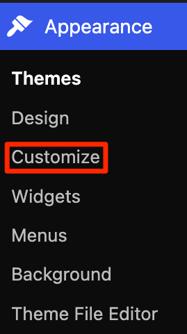
For child themes, add your hover effect CSS to the style.css file.
Be cautious when editing theme files directly, as this can cause conflicts between different plugins and themes.
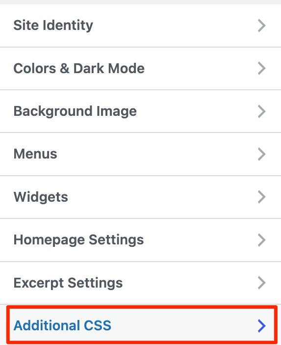
Using the Customizer
Where you add custom CSS depends on your WordPress theme type:
For Classic/Non-Block Themes:
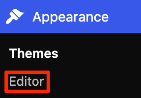
- Navigate to Appearance → Customize → Additional CSS.
- Add your hover effect CSS code.
- Preview changes in real-time before publishing.
For Block/Full-Site-Editing (FSE) Themes:
- Go to Appearance → Editor.
- Click Styles.
- Add your hover effect CSS code.
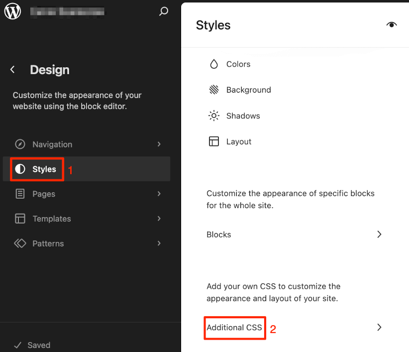
This method allows you to target specific CSS class applied to the Gutenberg block, though these styles won’t be reflected in the editor itself, only on the front-end of your site.
⚠️You won’t find the Additional CSS option in the Customizer with some FSE themes, or if a plugin disables the Customizer, or if your user role lacks the edit_css capability.
How to Add CSS Classes to Blocks
To apply effects to specific elements:
- Select your block in the editor.
- Open the block settings sidebar.
- Find additional CSS classes under the ‘Advanced’ dropdown.
- Add a descriptive class.
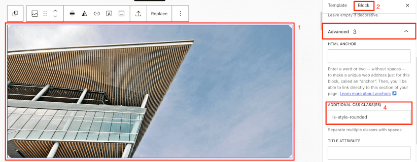
This gives you precise control while maintaining clean organization.
For more complex implementations, consider creating a child theme, using wp_enqueue_style() in functions.php, or creating a simple plugin that loads your custom CSS.
FooGallery: Removing the CSS Headache From Your Image Hover Effects
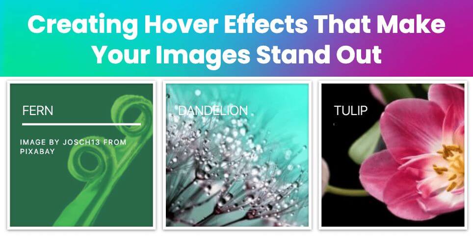
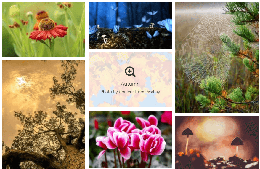
CSS is tricky to deal with if you don’t have basic coding knowledge. If that is the case, you can utilize various plugins to create hover effects without coding. FooGallery is a powerful WordPress plugin designed to help you create organized and visually appealing image galleries. One of its standout features is the ability to add sophisticated hover effects to your gallery images with just a few clicks.
For a comprehensive guide on different approaches to implementing hover effects, you might also want to check out our article on How to Add Image Hover Effects in WordPress.
Available Hover Effects in FooGallery
The free version includes essential hover options:
- Overlay Options: Choose between light, dark, or transparent overlays. The overlay can be set to either light or dark, or transparent for no overlay, while still showing other hover effects.
- Color Effects: Create transitions between grayscale and full-color images.
- Scaling Effects: Make thumbnails enlarge or zoom the image while keeping the thumbnail size consistent.
- Caption Controls: Display captions only when visitors hover over images.
- Icon Display: Show informative icons on hover to indicate actions.
Check out a live demo of all the hover effects you can configure using FooGallery free.
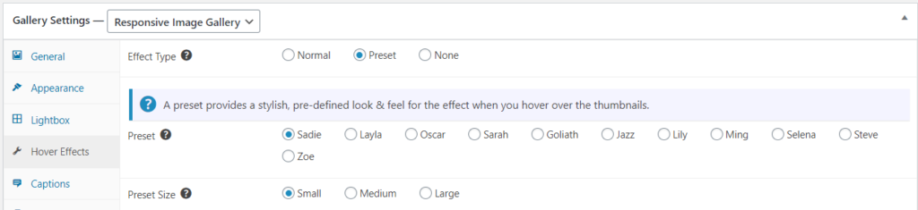
FooGallery PRO expands these capabilities with 11 preset hover effects that combine animations and transitions for more sophisticated interactions.
For example, Sadie allows you to unfold a caption from an image title on hovering while Selena scales the image and reveals the description.
Sadie…


Selena…
How to Implement Hover Effects with FooGallery
- Install and activate the FooGallery plugin.
- Create a new gallery by going to FooGallery → Add New.
- Add your images and select a compatible gallery template.
- Configure hover settings in the “Hover Effects” tab.
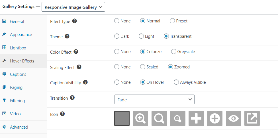
- Select “Normal” as your hover effect type (or “None” if you don’t want any).
- Customize overlay type, color effect, scaling effect, and icon options.
- For PRO users, explore the preset hover effects.
- Preview your gallery before publishing.
You can also choose whether captions appear on hover or below the image when using templates like Masonry, giving you flexibility in information presentation.
Using a lightweight hover effects plugin like FooGallery will create minimal bloat compared to alternatives, keeping your site running efficiently without sacrificing visual appeal.


Best Practices for Implementing Hover Effects
Using hover effects is an effective way to draw attention, highlight elements on the page, and provide additional information for your users. However, you should be aware of some of the best practices to follow when adding hover effects to images on your site.
- Don’t go overboard; understanding your audience, your website, and how to maintain a consistent and professional feel is key. Overuse of effects is a common mistake, leaving your website feeling cluttered and jarring.
- Make sure key information isn’t only displayed in hover effects, as mobile users usually will not have a cursor to trigger the effect. Similarly, information should be accessible via keyboard navigation.
- Make sure your hover effects match your website’s aesthetics: opt for consistent color tones, font and text and so on.
- Set your hover effects to require some delay before activating, as if they are triggered too easily, it can create a frustrating experience for users navigating your site.
- Avoid effects that impact legibility. Information and visual cues should be clear to your users.
- Ensure your hover effects don’t negatively impact site performance or page speed.
Craft Perfect Image Hover Effects with FooGallery
Whether you’re a CSS superhero coding effects with your bare hands, or just a mere mortal looking for gallery greatness without the headaches, the goal is the same: wow your visitors!
Not everyone needs to wear a cape and fight with semicolons all day – FooGallery PRO is your ultimate gallery sidekick, doing all the heavy lifting while you take all the credit.
Why struggle with code when you could be sipping coffee and clicking your way to hover effect perfection? Check out FooGallery PRO today and transform from stressed-out webmaster to gallery genius in minutes!