
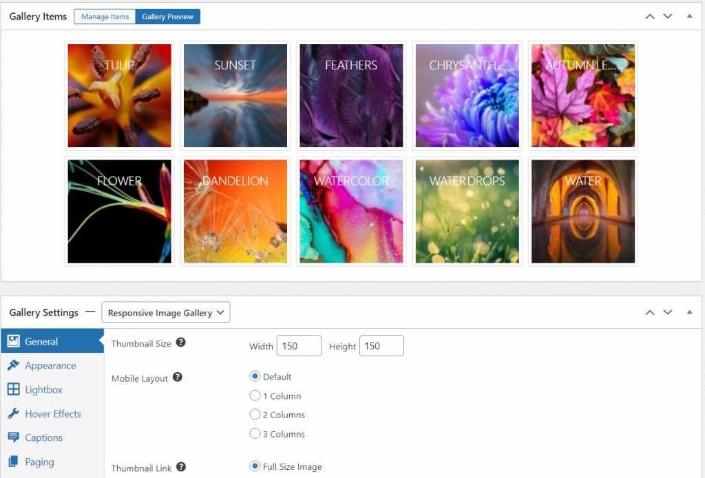
The Responsive layout keeps all of your thumbnails the same size. You can adjust the dimensions for the thumbnails. Once you open the gallery, the lightbox will adjust automatically to the size of the image and the size of the screen.
This is the default gallery layout for FooGallery. However, if you have changed your gallery defaults, you can select this layout from the layout selector above the Gallery Settings.
Below is a screenshot of the gallery preview using the Responsive layout.
General Settings
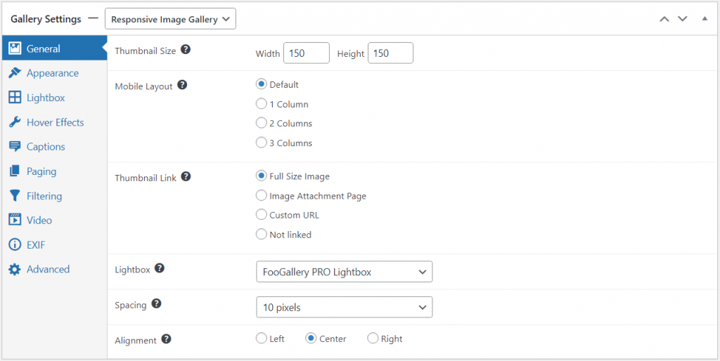
The general settings for the Responsive Image Gallery layout allow you to adjust the size of your thumbnails. You also have the option of choosing a mobile layout. This will force the thumbnails into 1, 2 or 3 columns when viewed on mobile, if enabled.
You are also able to link the images to a lightbox, and select the lightbox you want to use. Additional settings let you change the spacing between the thumbnails and set the alignment of your thumbs.
Here’s a screenshot showing these settings
View a demo of the responsive gallery layout in action.
Mobile columns and spacing
The Responsive layout adapts to smaller screens automatically by default, but you can choose to fine-tune how the gallery will look on mobile devices if you prefer. The free version of FooGallery allows you to change the number of columns on mobile. To change the other mobile-enabled settings, you will need to upgrade to a PRO plan.
For the editor workflow and supported settings, see Using Mobile Gallery Settings in FooGallery PRO.


