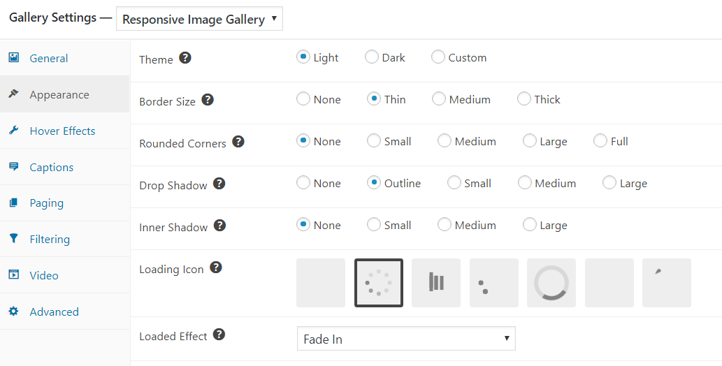
The Appearance settings allow you to alter the appearance of your thumbnails.
The Theme refers to the color of the border around the image. You can choose white or black. Alternatively, you can select Custom and then provide your own Custom CSS.
The Border Size refers to the width of the border around the thumbnails. You can choose between Thin, Medium and Thick, or select None to have no border.
Rounded Corners quite simply rounds the corners of your thumbnail border. You can select None for a sharp corner. Small, Medium and Large offer increasing degrees of curve, while Full makes the thumbnails completely round. The rounded corners apply to the border, rather than the image. If you would like your image to have rounded corners, select None for the border.
The Drop Shadow and Inner Shadow settings apply increasing amounts of shadow. The drop shadow refers to the shadow of the thumbnail, while the inner shadow is the shadow inside the thumbnail.
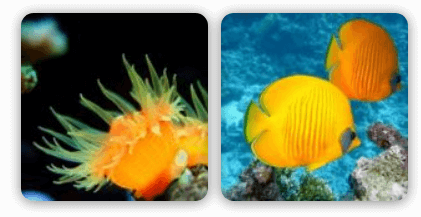
Here’s a quick look at some thumbnails with no border, Medium Rounded Corners and Medium Drop and Inner Shadow:
The Loading Icon is the icon that appears while the thumbnails are loading. To have no icon select the first block, which is blank.
The Loaded Effect refers to the animation used when displaying the thumb, once it has loaded.
Finally, the Instagram Filter – only available in FooGallery PRO – enables you to apply one of the many Instagram filters we have included to the images in your gallery.