
The Masonry gallery layout sorts your images like tiles. The size and orientation of the image therefore impacts on the layout of the gallery.
To use the Masonry gallery layout, choose Masonry from the Gallery Layout metabox above the gallery items.
Below is a screenshot of the Gallery Preview of the Masonry Image Gallery.
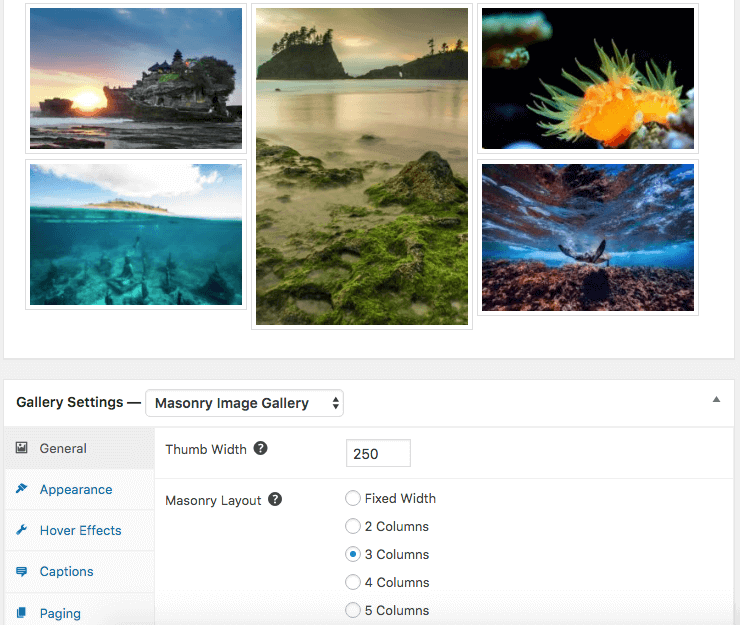
General Settings
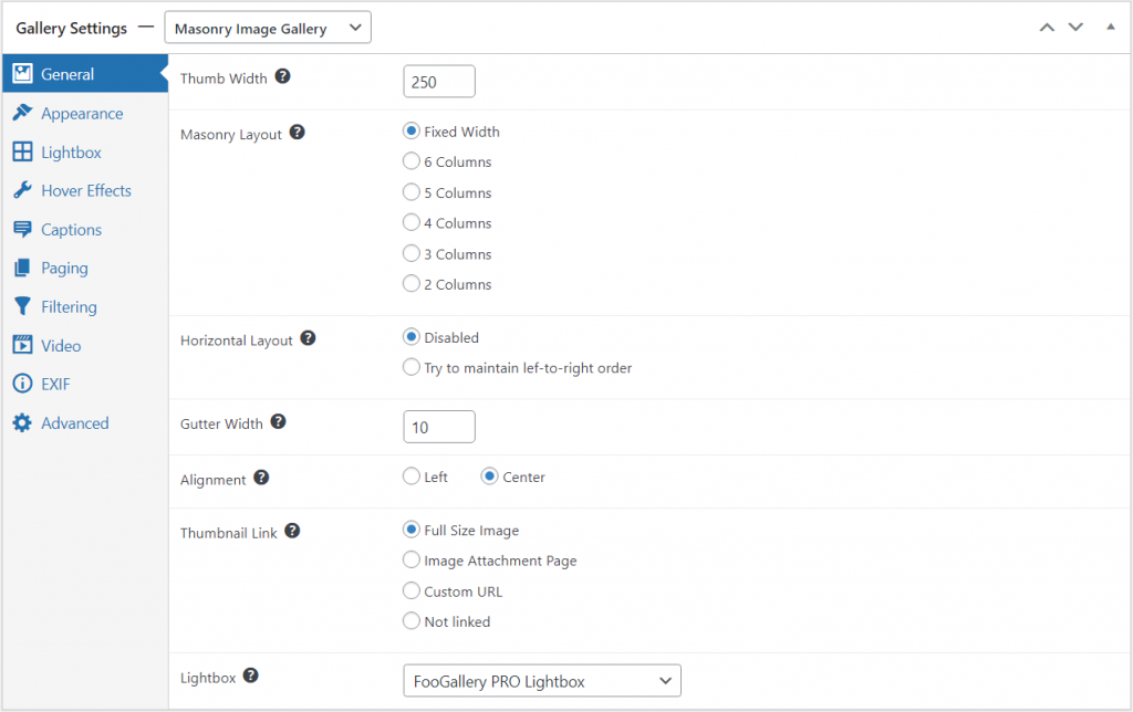
With this gallery, you can adjust the thumbnail width and the number of columns. These adjustments will impact the layout of the gallery. The masonry layout may sometimes rearrange images to fit them in where possible. To change this, you can enable the Horizontal Layout feature; this tries to maintain the order of images as you have set them.
Other settings include the gutter (or margin) width between images and the alignment of the images in the gallery. They can only align left or center. You can also set your images to open in a lightbox.
Adjust Masonry for phones
With PRO Starter or higher, Mobile Gallery Settings can give Masonry a different layout, thumbnail width, and gap on phones while keeping the desktop arrangement unchanged.
See Using Mobile Gallery Settings in FooGallery PRO for more details on how to setup mobile gallery settings.


