FooBox PRO includes 4 themes and gives you various options for theme colors, along with other styling features.
Themes
The default theme is Rounded, giving you a small border and slightly rounded corners once the image has opened in the lightbox. (This is the only theme included in the free version of FooBox.) FooBox PRO then also includes the Metro, Flat and Glass themes. Metro gives you a small, squared-off border, while Flat removes the border altogether.
FooBox’s new Glass theme is a Glassmorphism style, which is a UI design style/trend that creates a frosted-glass look for interface elements, making them appear like translucent panels that float over backgrounds with a soft blur behind them.
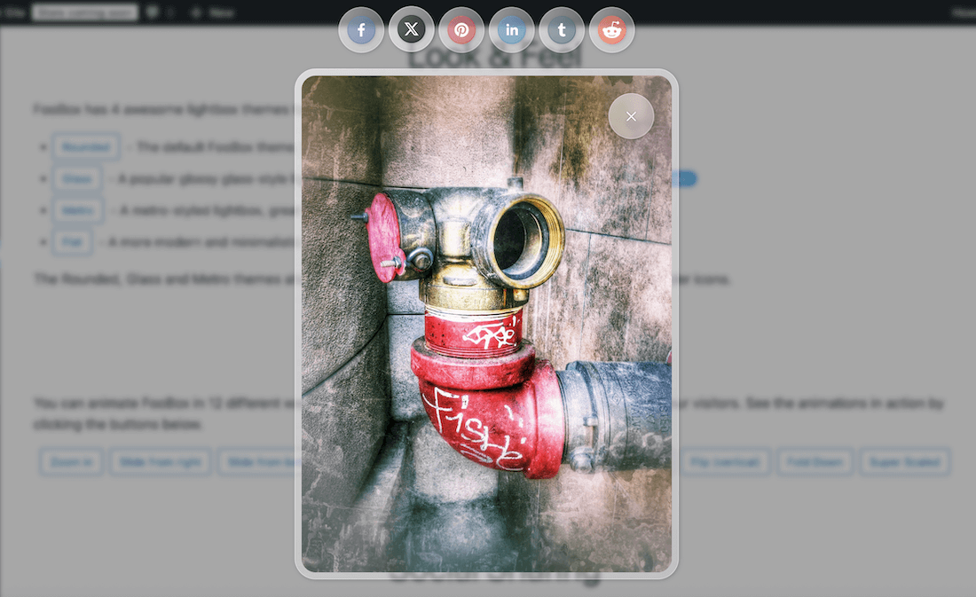
Below is a screenshot of the Glass Theme demo.
Enabling any of the themes will ensure that all images or other elements opened in FooBox will have the same appearance.
Styling
Once you’ve selected a theme, you can choose to use the default color scheme, or you can select one of the colors provided. Alternatively you can choose the custom color picker and select the options you prefer for the lightbox base and text colors.
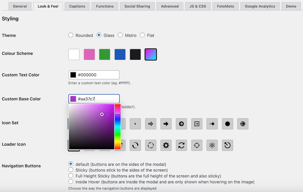
Note that colors selected with the Glass theme will be slightly muted as the borders are opaque.
Once you have chosen your theme and color, you can then also set the appearance and behaviour for the navigational arrows and loading animations.