
The Slider PRO Gallery works as a slider, with one central image and smaller thumbs for the rest of the gallery appearing on the side or below the main image. This gallery allows you to scroll through the images on the page, so it doesn’t open in a lightbox.
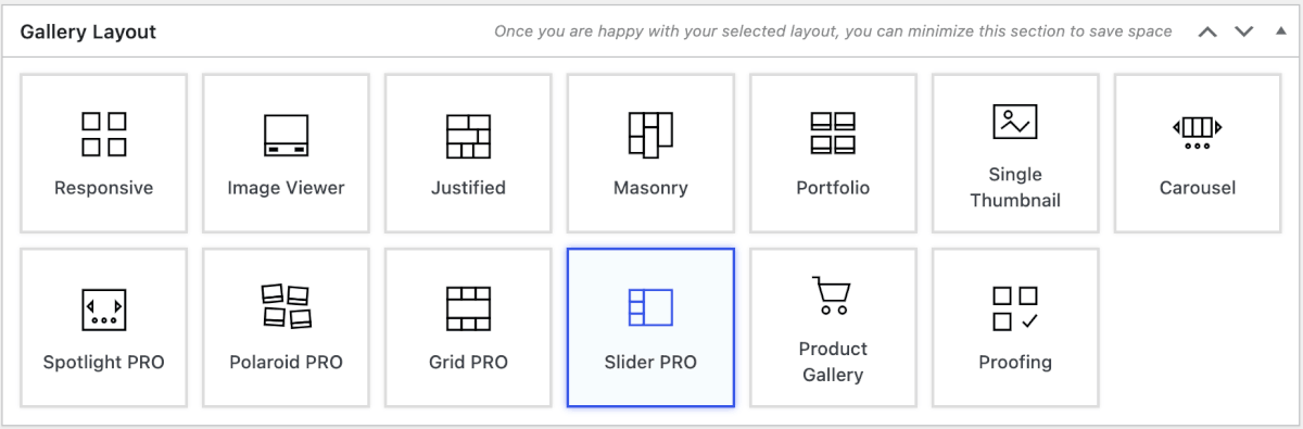
To use the Slider PRO layout, choose Slider Pro within the Gallery Layout section. This layout is available with any of the FooGallery PRO plans.
General Settings
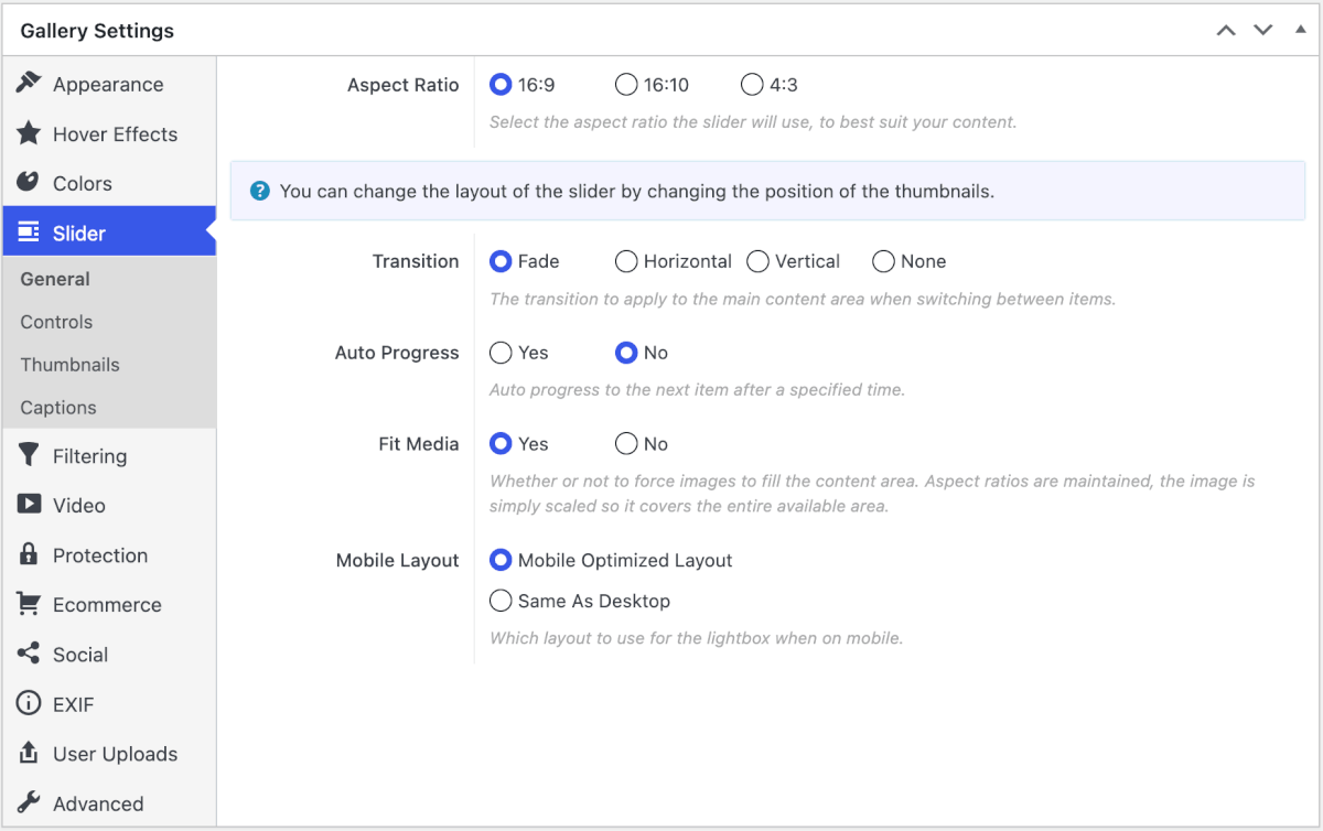
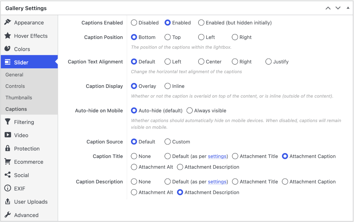
With the Slider PRO layout, images are displayed in the main panel rather than in a lightbox. You can, however, change the appearance of the panel and thumbnails in the General, Controls, Thumbnails, and Captions tabs.
The General settings for the Slider PRO gallery let you choose the aspect ratio for your panel. You are also able to adjust basic settings such as the transition, Auto Progress, or Fit Media. You can then select whether you want the gallery optimized for mobile or to keep it the same as on desktop.
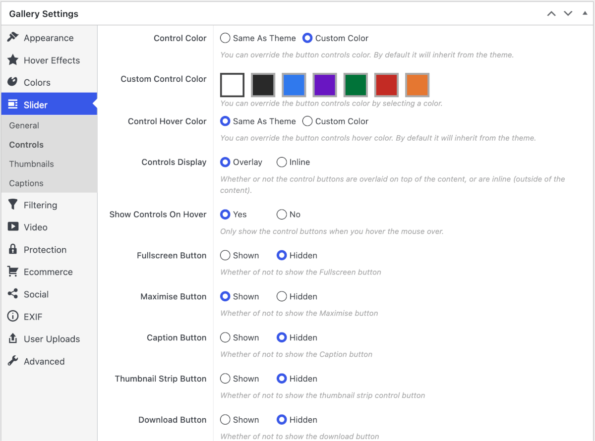
The Controls settings change how the controls in the panel look and work. For example, you can change the control colors, set them to display on hover, or include various buttons, such as the Fullscreen button.
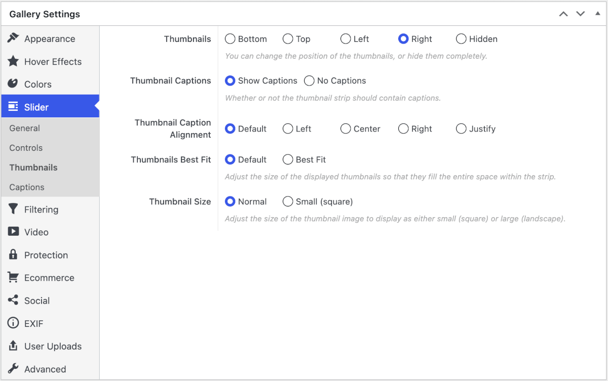
In the Thumbnails tab, you’ll find settings for your gallery thumbs. Here you can choose the position of the thumbnail strip, for example, above or to the right of the panel. You can also adjust how the captions and thumbnails fit into the space.
The Captions tab gives you control over what captions are used and where they appear. You can enable or disable captions and set their position and alignment. You can then select what fields to use for the caption title and description.
Choose a phone-friendly aspect ratio
Slider PRO can use a different aspect ratio on phones when the wider desktop crop feels too short on a narrow screen. The desktop slider keeps its original ratio.
See Using Mobile Gallery Settings in FooGallery PRO for the complete workflow.


