
Wall PRO turns a photo collection into drifting columns. Give the wall its own space in the page or place it behind a section, then choose how visitors open the photos. Try the live Wall demo.
In this guide
- Before you start
- Create an inline photo wall
- Place a wall behind content
- Set the motion and appearance
- Choose what photo clicks do
- Check mobile and reduced motion
- Troubleshooting
- Related layouts and next steps
Before you start
Wall PRO is included in FooGallery PRO Starter, Expert and Commerce, starting with FooGallery 3.3.20. It is not part of FooGallery Free. Install and activate a supported PRO version and licence, then open FooGallery > Galleries in WordPress. Compare the plans if you also need video, filtering or selling tools.
Create an inline photo wall
- Create a gallery and add enough varied photos to fill several columns. Give images useful titles and alt text in the Media Library.
- Choose Wall PRO in the gallery layout selector.
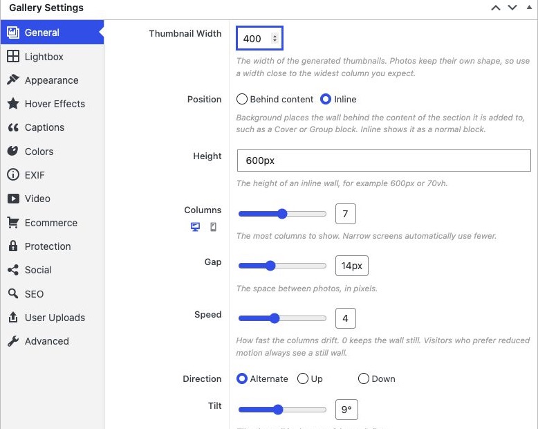
- In General, set Position > Inline. Give the wall a Height, such as
600pxor70vh. Inline gives the wall its own space in the normal page layout. - Save the gallery. Add it to a page with a FooGallery block or its generated shortcode.
Place a wall behind content
- Add a core Group or Cover section in the WordPress editor. Add the heading, text and buttons that belong over the wall, with enough padding or minimum height for the section.
- Place the FooGallery block or Shortcode block inside that same section.
- In the gallery General settings, choose Position > Behind content. Leave Section blank to use the closest supported Group, Cover, section or header.
- If you need to target a particular section, give it an HTML anchor such as
photo-heroand set Section to the CSS selector#photo-hero. Use a unique anchor and check the frontend result. - Choose suitable Shade and overlay text colours, then check that every link and button remains readable and usable. Use a decorative click setting when the wall should not compete with the section actions.
The gallery Height setting controls an inline wall. A background wall follows its host section, so set that section’s height and spacing in the page editor. The hero on the FooGallery product page shows a wall behind content.
Set the motion and appearance
| Setting | What to choose |
|---|---|
| Thumbnail Width | Controls the generated thumbnail width. Choose enough pixels for the widest column you expect, using originals large enough for a clear result. |
| Columns and Gap | Columns is the maximum number to show; narrow containers can fit fewer. Gap controls the space between photos. |
| Speed and Direction | Speed controls the drift; 0 keeps the wall still. Direction can send columns up, down or in alternating directions. |
| Tilt | Rotates the wall. Use 0 for a flat wall and check the edges when increasing the angle. |
| Shade | Use Centre vignette or Even to help text stand out over the photos, or None when an overlay is unnecessary. |
| Pause On Hover | Pauses motion while a mouse pointer rests over the wall. Touch visitors do not have an equivalent persistent hover state. |
Choose what photo clicks do
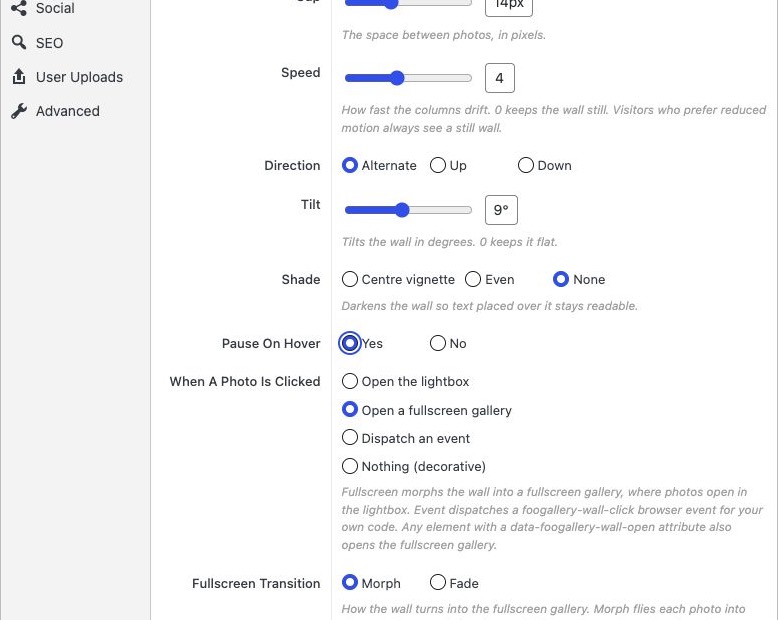
- Open the lightbox: opens the selected photo directly in the configured lightbox.
- Open a fullscreen gallery: opens a fullscreen overview first; selecting a photo there opens the lightbox. The Wall demo uses this behaviour.
- Dispatch an event: emits
foogallery-wall-clickfor custom developer code. It does not create a destination by itself. - Nothing (decorative): leaves the wall as a visual backdrop without a photo-click action.
When fullscreen browsing is selected, choose its Fullscreen Transition and, where available, the fullscreen header options. Morph moves photos into place; Fade uses a cross-fade. Reduced-motion preferences use an instant transition. A custom element with data-foogallery-wall-open can also open the fullscreen gallery; developers should give it an accessible name and normal keyboard behaviour.
Check mobile and reduced motion
Use the gallery editor’s mobile preview to set a separate Columns value. Start with fewer columns on phones, then check the public page on a real device. The live demo uses seven desktop columns and three mobile columns as an example, not a required configuration.
Visitors who request reduced motion see a still wall even when Speed is greater than 0. This is expected. Check the content, photo-click action and close controls in both moving and still views. See Using Mobile Gallery Settings for the shared preview workflow.
Troubleshooting
- The wall is missing behind a section: check Position, the closest Group/Cover and any Section selector. Make sure the host has visible height; start with Inline to verify the gallery itself.
- The wall does not move: check Speed and Pause On Hover, then your device’s reduced-motion preference. Still mode is intentional for reduced-motion users.
- Photo clicks do nothing: check When A Photo Is Clicked. Event requires your own handler, and Nothing intentionally has no photo action.
- Text or buttons are difficult to use: adjust Shade, contrast, padding and the host section, and avoid decorative photos competing with the primary CTA.
- You need filters or paginated browsing: Wall does not provide ordinary gallery filtering or paging. Use Mosaic or another supported browsing layout, with a plan that includes the extra features.
Related layouts and next steps
Choose Mosaic for a varied tiled collection, or Spotlight when one large image should lead. Read the Mosaic setup guide.


