At the start of 2024, mobile devices accounted for over 60% of all web traffic. This is a clear indication that website owners and developers need to cater for both desktop and mobile users. Not doing so could have a severe, negative impact on your site.
However, optimizing images and image galleries across devices on WordPress sites presents technical challenges. High-resolution gallery images can impact load time and bandwidth usage, so optimization is a must. But what is the best way to scale images for a responsive website?
In this article, we’ll discuss how to automatically scale photos and galleries to responsive sizes based on device in WordPress, allowing your users to experience automatic device-appropriate image scaling without taking a hit on your site’s speed and bandwidth.
Why WordPress Needs Responsive Images: Speed and User Experience
While responsive design is a necessity for all sites, responsive images are particularly important for portfolio and image-heavy or gallery sites that need to load dozens of high-resolution images at once.
“High-resolution images are essential for portfolio and gallery sites to showcase work in crisp detail. However, these same high-quality images can create significant loading delays and bandwidth issues when dozens need to be loaded at once. This is especially problematic for mobile users who may have slower connections or data limitations. Responsive images solve this by delivering appropriately-sized versions based on the user’s device and screen size.”
Steve Usher, developer at FooPlugins
Images often account for the majority of webpage weight according to HTTP Archive data, which means that these kinds of sites need to ensure they have clear, fast-loading images across all devices. This will go a long way to ensuring a smoother user experience.
Another reason for ensuring images are responsive across devices is that search engines prioritize sites with optimized images. Core Web Vitals scores (a ranking factor for SEO) are also affected by image loading performance. As such, fast-loading responsive images are essential for good SEO.
How FooGallery PRO Handles Responsive Images Automatically
FooGallery PRO is the ideal solution for automatically handling and scaling responsive images across your WordPress portfolio or gallery site. This plugin ensures images are automatically optimized for various screen sizes, without the need for manually inserting CSS to configure responsive images.
This is because FooGallery PRO generates multiple image sizes and sets breakpoints for each image at the moment you upload it. This results in quick image loading and optimal performance across all devices and screen sizes.
FooGallery also allows you to set up, manage and display image galleries across your site, making it an all-in-one solution for photographers and portfolio sites using WordPress to showcase their work.

The Best WordPress Gallery Plugin
FooGallery is an easy-to-use WordPress gallery plugin, with stunning gallery layouts and a focus on speed and SEO.
Setting Up FooGallery’s Responsive Image Features
To configure responsive image features in FooGallery PRO, you can follow the below step-by-step guide:
- Download and install the plugin. To do this, go to your WordPress Dashboard > Plugins > Add new. Search for ‘FooGallery’ and once located, click on Install and Activate.

- Upload the image you want to use, or choose an existing image from the media library.
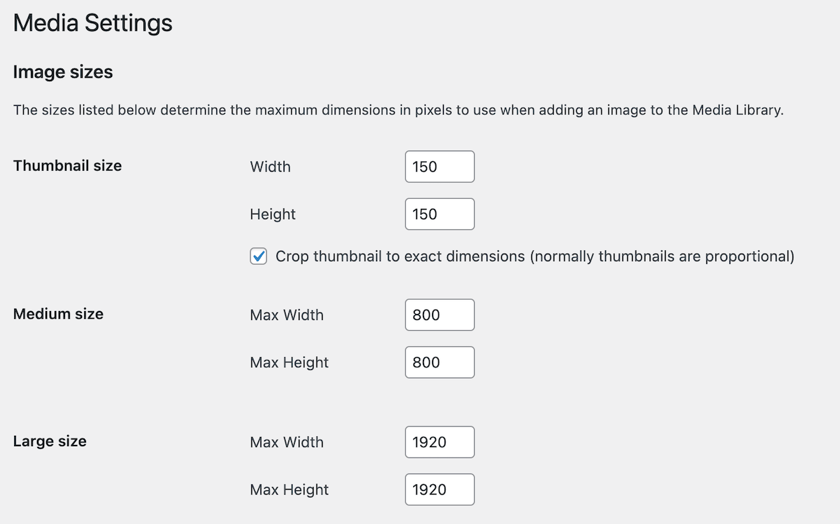
- WordPress will automatically create different image sizes when an image is uploaded, based on the sizes settings stipulated in your WordPress media settings. FooGallery will also then create thumbnails based on these settings.
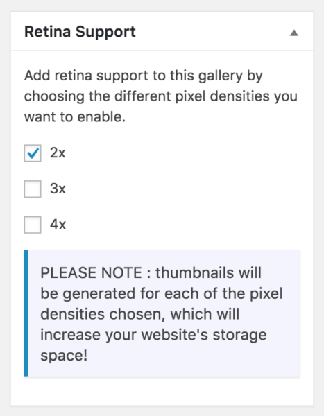
- You can also generate 2x or 3x thumbnails if you enable this in the Retina Support settings in FooGallery. To do this, navigate to ‘Images’ and find the ‘Default Retina Support’ settings in the FooGallery settings. Choose your size (2x is recommended) and click ‘Apply Defaults to all Galleries’. These will be used for devices that support Retina display.
- Next, in the gallery settings, select ’Image Viewer’ for your gallery layout, which will show your image in a thumbnail on your page or post. (The full-size image will be shown in a responsive lightbox when clicked.
- Adjust any desired styling elements for your gallery, set the thumbnail size, save the gallery, and add it to the page or post where you want your responsive images to appear. This can be done with the FooGallery block or with shortcodes.
- Publish your page or post, and test the responsive behaviour of your image on different devices to ensure they are displaying properly.


If you want to display individual images on your website, and ensure they are fully responsive, then you can follow the above steps. However, with FooGallery you can also easily create responsive image galleries.
How to Set Up Responsive Galleries With FooGallery
Creating responsive WordPress galleries is easy with FooGallery PRO! Here’s what you need to do:
- In the FooGallery settings, click on ‘Add Gallery’. A new gallery page will open, where you can add media from your WordPress media library to create your responsive gallery. You can also upload new images directly to the gallery, or import videos (available FooGallery PRO Expert and up).
- Next, in the gallery settings, select ‘Responsive Image Gallery’ as your gallery layout. This is a grid layout that displays responsive gallery thumbnails, and allows full-size images to be shown in a responsive lightbox when clicked. Note that while we’re using this gallery as an example, all of FooGallery’s built-in gallery layouts are responsive, so you can follow this tutorial with any one of them and get the same results. However, be aware that some of the layouts are available only in the PRO plans.

- Add styling elements for your gallery, save it, and add it to the page or post where you want your responsive images to appear, which can be done with the FooGallery block or with the gallery shortcode.
- Publish your page or post, and test the responsive behaviour of your images on different devices to ensure they are displaying properly.
Here’s a demo of the Responsive gallery layout:


Converting Existing Galleries to Responsive Formats
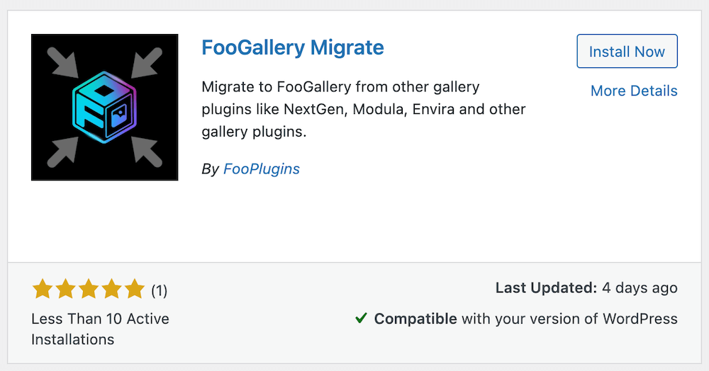
If you find that you have existing WordPress galleries with a third-party plugin that aren’t responsive, you can easily migrate those galleries and use FooGallery to make them responsive.
FooGallery Migrate is a plugin designed to make gallery migration simple. With it, you can easily migrate your galleries from several WordPress gallery plugins across to FooGallery. Different plugins offer different customizations, but FooGallery Migrate tries to ensure that your galleries look as similar as possible to your original layouts.
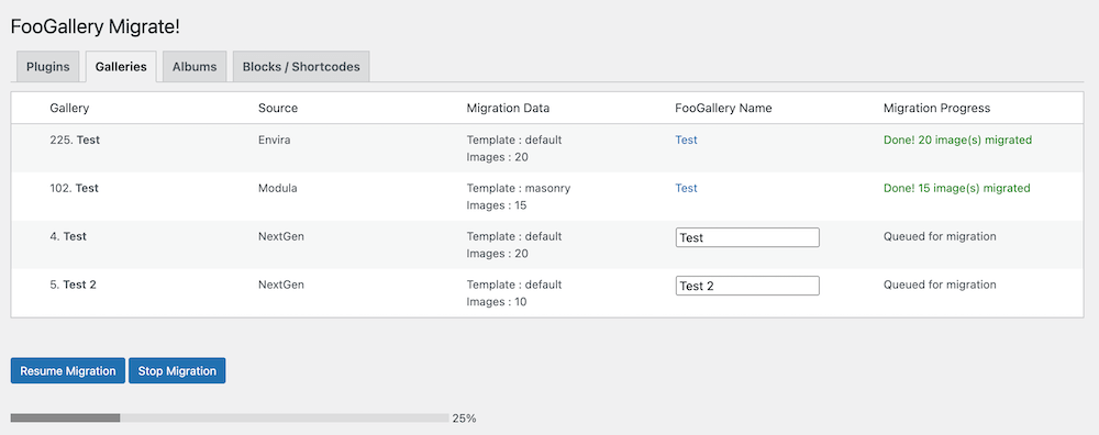
Migrating galleries is a simple process. You’ll need to install both FooGallery and FooGallery Migrate, following which you can identify and select the galleries you want to move across. Once the migration is complete, you can customize your galleries with the settings available to you. Then check that they are published and test them on different devices to ensure they are fully responsive.
Advanced Responsive Image Optimization in WordPress
WordPress’s native responsive image handling only really deals with thumbnails, medium and large image sizes. However, this can be enhanced by FooGallery, giving you a more granular control over gallery image presentation.
For example, FooGallery Pro has 10 different responsive gallery layouts including Grid PRO, Slider PRO, and Polaroid PRO templates that automatically adjust based on screen size. However, you are also able to set thumbnail sizes for any of the gallery layouts.
FooGallery’s responsive features work in conjunction with its lazy loading image capabilities to optimize page performance. This ensures image thumbnails are only loaded once they have been scrolled to, so you can avoid lengthy page load times.
The plugin also handles high-DPI/Retina displays through automatic image scaling; you can set retina ready images default scaling in Settings → Images → Default Retina Support. This will ensure that screens that support these images will display these images.
As you can see, FooGallery transforms the standard WordPress Media Library into a responsive image ‘powerhouse’. With all of the advanced controls, additional customizations, and pro features, FooGallery has everything you need for displaying beautiful responsive images.
The Best WordPress Gallery Plugin
FooGallery is an easy-to-use WordPress gallery plugin, with stunning gallery layouts and a focus on speed and SEO.
Transform Your WordPress Galleries Today With FooGallery PRO
For many types of WordPress sites, such as portfolio and photography sites, having responsive images is essential. With FooGallery PRO’s 10 gallery layouts, you can easily maintain responsiveness across devices and show your images in a beautiful gallery display.
The free version of FooGallery gives you everything you need to create basic galleries, but FooGallery PRO expands on this with additional templates (such as the Polaroid, Slider and Grid PRO in the FooGallery PRO Starter plan). Depending on the Pro plan, you also get access to hover effect presets, front-end filtering so users can sort images from your galleries according to tags or categories, gallery loading from external sources, and responsive video support, to name just a few of the advanced features.
If you want to create responsive image displays that don’t slow down your page load times, we recommend trying FooGallery. Take a look at the different plans to see which one works for you, and start your 7-day free trial of FooGallery.