
Responsive web design is more than just a buzz word. It’s something every site needs to consider, and with WordPress, it’s easily achievable. But what is it? And how do you go about making sure your website design is responsive? This blog post is going to take a closer look at what you need to know about this concept.
What is Responsive Web Design?
Responsive web design focuses on ensuring your site, and all the elements on it, can respond to the screen size from which it is being viewed. In other words your page layout can adapt, shrink or enlarge itself, depending on whether it is being viewed on a tablet, phone or computer screen.
W3Schools explains that “responsive web design is about creating web pages that look good on all devices!” This happens because the pages adjust automatically to fit the device screen or viewport being used.
Essentially, your layout (or the content on your site) fits relatively into the available space on the screen. WPBeginner goes on to explain that fluid design is the opposite of a fixed layout, which has a fixed width in pixels.
So whether you’re using a tablet, phone or computer, each element on your site needs to be readable or clearly visible. A good example of this is your top bar menu. If you look at a menu on a bigger screen, it may be right aligned and the menu items may all fit neatly next to one another.
But what happens when you shrink the screen size? If you have a responsive web design, you’ll see that if you make the screen smaller, the menu items should shift closer together and eventually collapse to be replaced by a menu icon. This is what would show on a mobile screen.
Do I Need a Responsive Website?
Yes, you do!
A responsive website means you don’t have to go to the trouble of building and maintaining a separate mobile site. Your site automatically adjusts to mobile devices, so you don’t need to design a separate site solely for mobile use.
A responsive web design is also a crucial element of your SEO: Google and other search engines understand that mobile usability is important to users. In a recent look at internet usage trends, SupplyGem found that the percentage of mobile users is on the increase and that almost half of internet usage comes from mobile users. So this has become a factor that search engines take into account.
According to Yoast SEO, “Google will determine rankings based on the quality of the mobile version of the site instead of the desktop version”. So having a mobile-friendly, responsive design can make a difference to your search engine ranking.
On top of this, if up to 50% of your users are indeed using mobile devices, a fixed layout could become frustrating. A responsive layout, which makes the viewing and navigation of your site easy on any device, means your website is more accessible and therefore more likely to see return traffic and repeat visitors.
How to Check Mobile Usability
It’s a good idea to create a responsive website, whether your traffic is predominantly mobile or not. It’s a safe bet that at least some of your traffic is mobile, and it’s quite likely that the percentage of mobile users will increase in the future. Regardless, if search engines are factoring in mobile usability, then you should too.
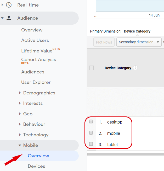
You can check your mobile stats and usability on platforms like Google Analytics and Google Search Console. Google Analytics can give you a breakdown of the numbers and percentages of your audience on desktop, tablet and mobile. To find this info, open up your Audience tab in Google Analytics and select Overview under Mobile.
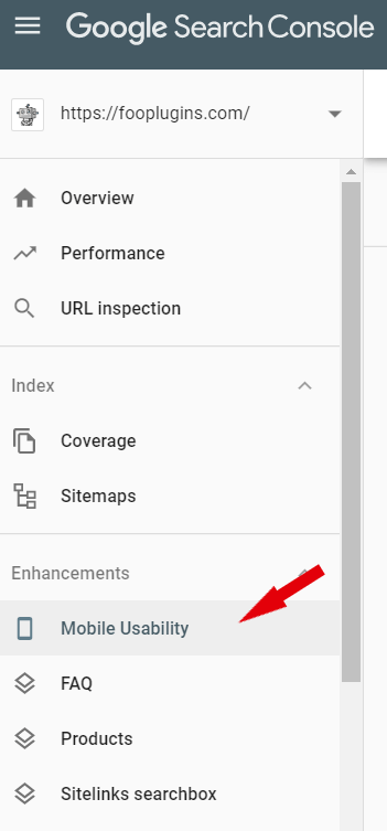
While these numbers are good to know, it’s probably more important to ensure that your site is mobile-friendly. To figure this out, you can take a look at your Search Console. This gives you an indication of how Google sees your site, and can tell you if you have any errors when it comes to mobile usability.
To check this, log into your Search Console and click on Mobile Usability – a report will be generated telling you whether there are any issues on your site.
If you don’t have a Search Console account, or just want to run a quick test, you can also use this handy Mobile-friendly Test. Simply add your URL to see if your site is mobile-friendly.
How to Make Your Web Design Responsive
With WordPress, creating a responsive website is pretty simple. The key is to really make sure that all of the elements on your site work within a fluid layout. This includes your images, galleries, tables, videos, menus, widgets and any other elements on your site.
Many current WordPress themes are responsive. If you’re starting a website, make sure that you choose a responsive theme. You can even use this as one of your search terms when looking for a new WordPress theme. If you don’t have a responsive theme on your current site, then you should consider updating your site to one. This may seem like a bit of a hassle, but it would be worth the effort.
Tip
Quick Tip
Quick Tip
If you’re just starting out with WordPress, take a look at this guide from Quicksprout on how to create a website with WordPress.
Having a responsive theme also works in your favor when you’re designing your site. You can easily switch between screen sizes when customizing your site, so you can see how different elements respond on different screen sizes. When you’re in your site’s Customizer, look for the screen icons at the base of the menu. Here you can switch between desktop, tablet and mobile screens to ensure your site is fully responsive.

It’s also important to make sure that any relevant plugins you use are responsive. Items like images, galleries and tables need to adjust with the screen size. Without this ability, users will only be able to see part of the image or table on their screen.
FooBox, for example, is a responsive lightbox that adjusts to fit your screen. So any image or form you open in FooBox will automatically scale. Likewise, FooGallery also adjusts depending on the screen size, such as when images move into a single column on smaller screens.
Using a responsive theme and plugins like FooBox and FooGallery can ensure that you have a responsive web design. The advantage of this is that your site accommodates mobile users, a factor that search engines consider to be important, meaning it can also help improve your search engine ranking.