Every second of load time beyond 3 seconds costs you 32% of mobile visitors, according to Google research. Add to this the fact that, as page load goes from 1s to 10s, the probability of bounce jumps 123%.
Forced account creation or heavy checkout flows add further friction. Google’s mobile UX audits explicitly recommend guest checkout because making accounts mandatory depresses conversion.
Taking these factors into consideration, it becomes imperative that WordPress site owners prioritize user experience. WordPress UX optimization involves systematically identifying and removing speed barriers, confusion points, and trust gaps that prevent visitor conversions.
However, most WordPress site owners implement changes without measuring actual impact on conversions or revenue. To prevent this from happening, our guide provides a systematic framework for identifying and removing friction points using FooPlugins for implementation and PageSpike.ai for measurement.
The Three UX Frictions and Why WordPress Makes Them Worse
Speed Barriers
WordPress users, in particular, could experience issues with speed, as theme and plugin stacks often add render-blocking JS/CSS and oversized images. On top of this, page builders may load site-wide assets even on pages that don’t use them. In a real-world scenario, this translates to a slow first render on mobile, shifting layouts (CLS), and delayed interactivity from third-party scripts and/or popup libraries.
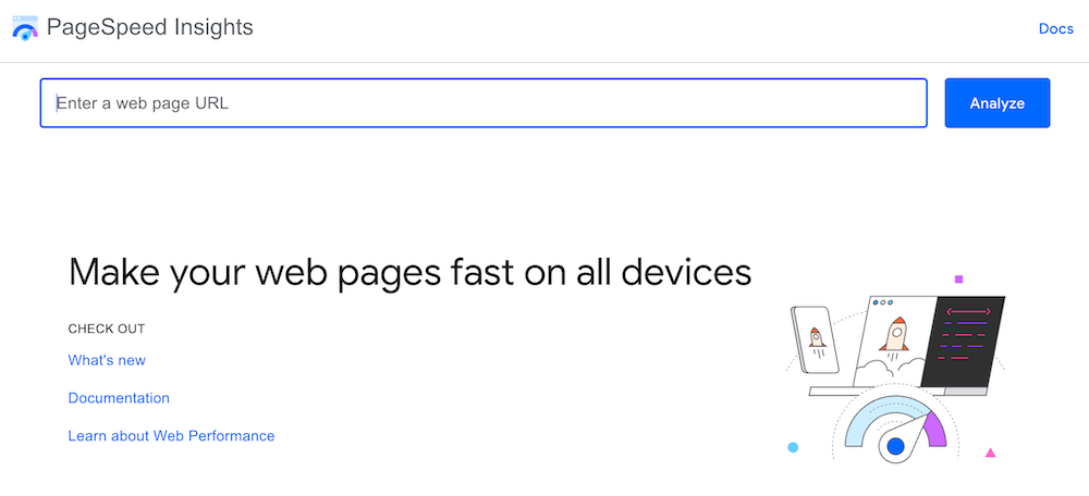
Slow WordPress performance can also be the result of bloated code, heavy images, and overloaded plugins. A quick PageSpeed Insights check (especially on mobile) helps spot the biggest issues — like poor LCP (slow to show main content), CLS (layout shifting), and INP (laggy interactions). Testing pages with plugins turned off can help reveal which ones are the main culprits behind low scores and sluggish loading.
To speed things up, defer non-critical JavaScript so the page’s visible parts load first, and only load gallery or lightbox scripts on pages that actually use them. Compress images before uploading to cut file sizes dramatically, and consolidate overlapping plugins to reduce unnecessary scripts and background load. These fixes can help to streamline how your site loads and feels, improving performance and user experience.
Confusion Points
Many WordPress sites unintentionally confuse visitors because of too many competing elements and inconsistent design. Plugins often add their own call-to-action (CTA) popups – all vying for attention at once. When these overlap or appear in different styles, users don’t know which action to take. Similarly, when blocks and buttons look different across pages due to theme or plugin inconsistencies it makes the site feel disjointed. Add-on forms can make things worse if they’re too long or cluttered, discouraging users from completing them.
Confusion also arises from poor interaction design. For example, “rage clicks” happen when users repeatedly click on something that looks clickable but isn’t, causing frustration. On mobile, menus that don’t open properly or buttons that are too close together cause misfires and drop-offs. Multi-step forms that don’t clearly show progress make users feel stuck or uncertain about how much is left to complete, often leading them to abandon the process entirely.
The biggest conversion killer is checkout friction. Around 70% of carts are abandoned globally, and complex, multi-step checkout flows are a key reason for this. Reducing the number of fields, simplifying the process, and making CTAs clear and descriptive can make an immediate difference. Tools like Microsoft Clarity or Hotjar can reveal user frustration points through session replays, while GA4 event funnels show where people drop off. Using scroll-depth tracking helps ensure CTAs appear at the right moments in the decision journey – not too early, not too late.

Trust Gaps
Trust gaps in WordPress stores are often the result of inconsistent or incomplete reassurance cues across the PDP (Product Detail Page), cart, and checkout. Generic page or checkout templates rarely inspire trust, and plugins can introduce popups or UI shifts that get in the way of pricing or change expectations late in the flow.
When shipping, tax, or returns messaging isn’t aligned from page to page, shoppers lose confidence, pause to re-verify information, or backtrack through tabs. These behaviors will generally result in abandonment, especially when totals update unexpectedly.
You can typically diagnose these issues by looking at session recordings or heatmaps around price reveals, tax/shipping changes, and hesitation near payment fields. This, along with a quick audit of where refund and shipping details appear, plus small survey prompts, can help pinpoint exactly where reassurances are missing.
To fix the friction, you can introduce trust signals at the points where doubt occurs – especially above payment fields – and keep totals consistent and visible. It’s also advisable to reiterate policies throughout the journey, and introduce familiar payment methods and security cues early. Because WordPress doesn’t communicate trust by design, stores need to place these signals deliberately to meet modern user expectations and maintain conversion.
A Framework for Measurable Fixes
Fortunately for WordPress site owners, there are a number of ways to address these issues.
Fixing Speed Barriers
- Compress images before upload using TinyPNG rather than server-side processing. The simplest way to do this is to drag-and-drop PNG or JPEG files directly into the TinyPNG web interface, download the optimized versions, and then upload those to your site.
- Run plugin audits: deactivate all plugins, measure the baseline with GTmetrix, and reactivate individually. This will give you an indication of which plugins are slowing down your site.
- Consolidate social sharing, don’t duplicate it: use built-in options that you already have (this could include FooGallery’s Social addon, FooBox PRO social sharing in the lightbox or FooBar’s Click to Tweet bar) instead of multiple third-party share scripts. You keep the UX, but cut extra JS.

- Standardize on one SEO plugin: disable overlapping features (such as schema, redirects, or analytics injection) across tools to avoid redundant code paths.
- Cull non-critical third-party tags: Google’s guidance is to avoid render-blocking JavaScript to speed up DOM ready.
- implement mobile-specific fixes: improving perceived speed means reducing both load and interaction friction. Ensuring 48×48 px tap targets prevents mis-taps that slow users down, and testing at Fast 3G conditions exposes real-world delays hidden by high-speed Wi-Fi. Plus, deferring non-critical JavaScript so key content renders sooner, gives users a faster, more responsive experience.
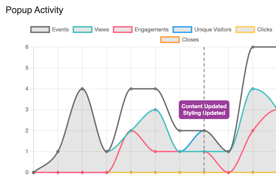
- Measure each change to ensure that it is having a meaningful impact. Check PageSpeed Insights (for mobile) and validate impact with FooConvert’s popup stats (Events, Views, Engagements, Unique Visitors).
Fixing Confusion Points
- Reduce form fields to the essentials only: each removed field increases the chance of completion by 5-7%.
- Another option is to implement multi-step forms to reduce perceived effort and cognitive load.
- Write action-specific CTA copy. Replace generic labels like “Submit” with outcome-based text (for example, “Download the SEO checklist”). Tests consistently find action-oriented microcopy performs better – you can then measure lift with FooConvert’s widget-level analytics (such as views, clicks, events or conversions) to find the best option for your audience.
- Position CTAs at natural decision points, which can be identified through scroll depth analysis.
Fixing Trust Gaps
- Place security or guarantee badges precisely where session recordings show hesitation, typically above payment fields. These work to reassure customers at the critical moment.
- Use specific social proof: saying “2,847 customers this month” beats a vague “thousands”, offering more realistic, trustworthy proof.
- Display trust signals progressively throughout your site and particularly on landing and payment pages. This could include company info on your homepage, testimonials on products, and security at checkout, to name just a few examples.
- Update testimonials monthly to maintain freshness and relevance signals.
FooConvert enabled me to create beautiful popups and bars without any page builders. It made it super easy to build popups and flyouts inside the block editor. The analytics are a huge bonus!
Jeffro
How FooPlugins’ Tools Strategically Improve UX
When improving UX on WordPress sites, the biggest gains often come from simplifying the toolset rather than adding more plugins. FooPlugins tools are designed to consolidate common UX needs – so instead of duplicating functionality with multiple scripts, features like FooBox PRO’s built-in social sharing or FooBar’s Click-to-Tweet replace standalone plugins and reduce some of the clutter.
You can also standardize by using an integrated FooPlugins stack, meaning sites load faster and behave more predictably. Shared resources and a unified codebase reduce HTTP requests, limit DOM complexity, and eliminate potential performance issues that come from stitching together disconnected tools. Bundled smartly, FooPlugins lets you cover galleries, notifications, and conversion optimization in one cohesive system – making UX improvements easier to implement, maintain, and scale.
FooGallery: Reduce Browsing Friction and Shorten the Path to Purchase
FooGallery PRO Commerce allows for WooCommerce integration for shoppable galleries – in this way, you’re not only displaying products in an eye-catching way, but you are also reducing the number of steps a customer needs to take to complete a purchase.
- Go faster from Browse to Buy. Use the WooCommerce integration to let customers add to cart directly from the lightbox. Products are added directly to the cart without requiring customers to navigate away – including product variations, which can be displayed, selected and added to the cart from the lightbox.

- Make use of the Add to Cart and View Product buttons on thumbnails or in the lightbox to enable shoppers to act without detours.
- Highlight products for easier decisions. Use the Sale, Featured or Out-of-stock ribbons and customizable buttons to guide choices in the gallery UI. These sync with your products in WooCommerce, allowing for a smooth workflow, and improved UX.
FooBar: Guide Attention and Remove Uncertainty Without Clutter
FooBar offers a range of notification bars and features that can be used to improve the customer experience while encouraging sales.
- Match the message to the moment. Use any of the 12 positions (e.g. top/bottom, inline, left/right, sidebars) and the state or trigger controls to display bars that reinforce your message (rather than disrupting it). For example, you can reduce cart abandonment with a while-timed exit-intent bar.
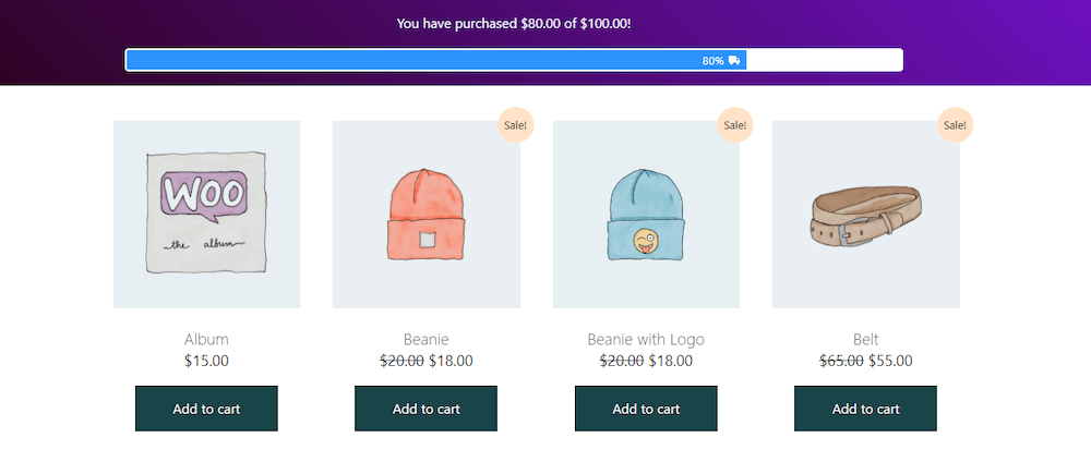
- The WooCommerce Free Shipping Bar provides value to customers while showing their progress toward free shipping. This offers additional value to users, reduces guesswork and nudges them to complete orders.
- FooBar’s purpose-built bars can be used for improved functionality and usability. Deploy Countdown Bars for timely promos or Click-to-Tweet bars for lightweight social proof.
FooConvert: Capture Intent With Just-Enough UI, then Prove it Helped
With its focus on creating popups, FooConvert can be used in multiple scenarios to improve user experience and conversions.
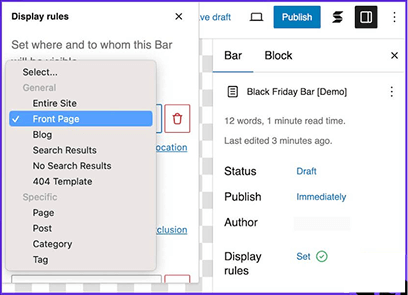
- Use the right UI for the job. Spin up Bars, Flyouts, and Popups from pre-designed templates to get the desired result, such as lead generation, newsletter sign-ups, form completion, and so on. You control the Display Rules (pages, posts, roles, etc) and Triggers (on page load, exit-intent, scroll percentage, timer, or anchor), so you can target users at the right point, without disrupting their journey.
- Embed forms cleanly. Drop Gravity Forms into popups or flyouts and enable inline-script compatibility for reliable rendering.
- Measure the results. The pop-specific analytics allows you to review Events, Views, Engagements, and conversions so you can assess the effectiveness of your message, offer and/or placement. This allows you to tailor your popups to suit your audience, for a better overall experience.
PageSpike.ai: Landing-Page Analysis and Validation
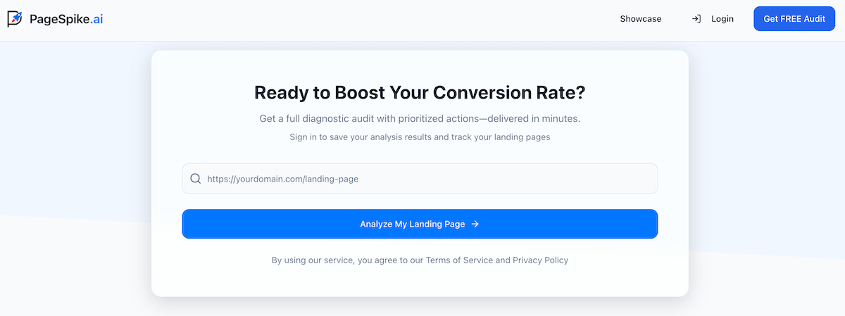
Having another ‘set of eyes’ on your landing pages can be helpful in highlighting UX issues that you may have missed. PageSpike is the ideal tool for this task, running a quick diagnosis of your landing page and offering key insights and recommendations.
- Use PageSpike.ai for checks on headlines, CTAs, layouts, or offer framing. Use the recommended actions and hints to address problems with the UX, followed by additional tests to verify that the fixes have worked.
- Analyze landing pages and test ideas based on the weak points it detects, then validate with your preferred testing tool or workflow.
- Implement UX patterns quickly with FooPlugins; then run these changes through PageSpike.ai to validate causation (not just correlation).
- Set up a workflow where you pair PageSpeed Insights and analytics from FooConvert to identify quick fixes. Once these are implemented you can test these tweaks with PageSpike for final proof.
Your Implementation Roadmap
Improving UX doesn’t require a full redesign – just a clear, repeatable roadmap. Start by configuring basic tracking for each UX element you implement or change. You can focus on simple metrics like views, clicks, and conversions at the popup level. This creates immediate visibility into what’s actually influencing user behavior and puts a stop to decisions based on assumptions.
Next, document each change in a lightweight tracking spreadsheet that records the date, what was adjusted, the baseline metric, and the result after 14 days. This discipline turns UX optimization into a measurable process rather than a one-off experiment.
To make this process sustainable, standardize your UX stack with the FooPlugins bundle – consolidating galleries, notifications, and conversion tools into one integrated, lean toolkit that’s easier to optimize, measure, and scale.