Did you know that ecommerce cart abandonment rates reached an all-time high of 70% in 2023? This could be the result of unexpected costs at checkout, or limited payment options. But users also often abandoned carts because of complex checkout processes, issues with mobile usability or poor website performance.
Having a good UX, or user experience, is one of the most important factors for persuading customers to go through with a checkout purchase, rather than leave your site. This can easily be accomplished by addressing some of the common concerns that customers have when checking out.
This article provides you with a list of 7 cutting-edge UX strategies for checkout optimization that can help store owners achieve double-digit increases in conversion rates.
1. Streamline Your Checkout Process for Instant Conversion Boosts
A streamlined checkout process is an essential element for good user experience. It should be as easy as possible for a customer to purchase your products. Here’s an example of a simple checkout on Marey.com.

There are several core best practices to apply for a more streamlined checkout. These include:
- Minimizing form fields to only ask for essential information during checkout, which reduces the amount of time required for customers to complete the checkout process.
- Implementing progress indicators, such as by showing a clear, step-by-step progress bar, allows users to know how many steps are left. This can help to reduce uncertainty and boost completion rates.
- Make it as easy as possible to pay. You can do this by integrating fast, one-click payment methods like Apple Pay, Google Pay, and PayPal to allow returning customers to check out quickly and easily.
- Add dynamic form validation to catch errors in real-time so as to reduce frustration and abandonment.
- Implement smart defaulting based on user behavior and location data. As Hubspot explains, you can use different forms or form options depending on where your visitor is from, or where they are in their journey.
2. Optimize for Mobile: The Key to Modern Ecommerce Success
A user-friendly mobile checkout experience is a must for any ecommerce store! 76% of consumers shop on smartphones due to efficiency; not optimizing for mobile could have a serious negative impact on your turnover.
When creating your checkout experience, you can cater for mobile by using the following strategies:
- Use a responsive design so that checkout pages automatically adapt to different screen sizes.
- Take your buttons and navigation arrows into account. It is particularly important to use large, touch-friendly and well-spaced buttons for easy navigation on mobile screens.
- Consider offering express and one-click checkout solutions on mobile. This can be highly-beneficial, as the easier it is to complete a checkout, the more likely it is that customers will do so.
- Minimizing the number of form fields for a streamlined checkout is even more important for smaller mobile screens. This reduces the number of steps needed for checkout and limits the opportunities for added frustration.
3. Leverage FooPlugins for Seamless Mobile Checkouts
FooPlugins’ various solutions offer a range of features to help optimize checkout UX. For example, you can use FooBar to create eye-catching notification bars that highlight product availability, free shipping thresholds or showcase limited-time offers, encouraging customers to complete their purchase.
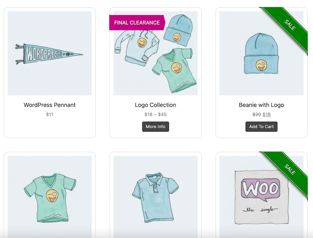
Additionally, you can set up a product gallery with FooGallery PRO Commerce, and showcase your best-sellers or new products on a single area. You can speed up the shopping process by setting up Buy Now or Add to Cart buttons that take your users to the respective product page or directly to the cart for an even speedier checkout.
The best solution from FooPlugins for checkout optimization, however, is FooConvert. With a wide variety of widgets, templates and helpful features, FooConvert offers the best solution for better UX on WordPress and WooCommerce sites that want an optimized checkout. Some of the top features include:
- Pre-styled templates: Create and customize your own bars, flyouts or popups, or use one of the pre-styled templates for quick and effective CTAs.
- Tailored visibility settings: Each widget you create can be tailored to display on all, some or even specific pages or posts. Plus you can select the users who are able to see the widget. This allows you to target your CTAs for particular audiences.
- Triggers: Similarly, each widget can be set to open (or close) on a particular trigger. These include on Page Load, Page Scroll, Anchor click or on Exit Intent. Using triggers, you can create offers for customers at various points in their journey, such as when they are planning to exit the page, and help reduce the rate of cart abandonment.

- Advanced analytics: FooConvert’s analytics will provide insightful and actionable data about your widgets and how they are converting. Using this information, users can adjust campaigns to improve conversions and increase sales.
The Best WordPress Conversion Plugin
FooConvert is an easy-to-use WordPress conversions plugin, draw attention, increase sales and engagement.
4. Simplify Form Fields and Offer Guest Checkout Options
Signing up to a website can sometimes work as a deterrent for customers. As such, it’s important to also offer simple forms which don’t require the user to sign up. Allowing customers to make purchases without creating an account can encourage more users to complete their transactions.

“The checkout form is like a conversation with your customer. Every unnecessary field is like interrupting them mid-purchase. Keep your fields few, meaningful, and well-timed, and you’ll find more customers making it through to ‘thank you for your order.'” Elvis Omondi, Support Lead at FooPlugins.
There are several ways to implement this, which can result in better UX and improved conversion rates. For example, you can use WordPress plugins like WPForms or Gravity Forms, which offer user-friendly interfaces. Forms should be concise and responsive, and include features like placeholders or progress bars, to reduce user effort. Providing clear error messages can also help to reduce frustrations.
Likewise, pre-filling known information or implementing conditional fields (optional fields that show only when relevant) are great ways to simplify your checkout forms by reducing the amount of information that a customer has to input. For example, you can use conditional logic to display a company name field only when users select a business account option, thereby helping to streamline your checkout.
There are even some advanced techniques, such as biometric authentication and one-tap purchasing, that you could consider, should your online shop need them.
5. Implement Smart Upselling Without Disrupting the Flow
One of the best methods for increasing sales from customers who are already on your store, is upselling. This is where a seller encourages a customer to purchase a more expensive or upgraded version of a product or service to increase overall value. (Cross-selling is a similar technique, but instead suggests complementary or related products.)

However, if your upselling strategy becomes too invasive, you run the risk of cart abandonment. Good UX can counter this. For instance, you should only show upsell options that relate directly to the items in the cart, such as a newer model, or complementary products or accessories. This approach feels more natural and enhances the shopping experience.
Another option is to show upsell suggestions at strategic moments to minimize interruptions, such as after the user adds an item to their cart or on the review page before payment. Subtlety is an important aspect of any upselling strategy, and can be achieved by Integrating suggestions with unobtrusive design elements like small icons or tooltips that allow users to easily explore additional products without feeling overwhelmed.
FooConvert is a great option for creating upsell CTAs that can be triggered at opportune moments. With this plugin you can craft various widgets (a bar or flyout would be the least disruptive) to offer product upgrades or additional, complementary products. These widgets can be triggered on specific pages or at specific points in the customer journey.
6. Add Progress Indicators to Reduce Uncertainty
Progress indicators are an almost universal standard in ecommerce checkout UX optimization. They can help to reduce purchase uncertainty by clearly showing shoppers how many steps are left in the checkout process, encouraging them to continue.
Progress indicators can also help to provide clear navigation cues and guide users smoothly from one step to the next, making the overall checkout process more intuitive.
Using a progress bar can also be beneficial for the store owner. Using data from the progress bar, you can analyze at which stage of the checkout users spend the most time or when they abandon their carts. This provides you with an opportunity to optimize those specific stages.
7. Use A/B Testing to Refine Your Checkout Experience
A/B testing is the concept of testing different iterations of your checkout process to continually refine and develop the best checkout UX experience for conversions on your store. For example, you could implement two different upsell CTAs, and then use A/B testing to assess which shows the higher conversion, or conversely, which results in higher cart abandonment. Based on this data, you can optimize your CTA for increased conversions.
A/B testing also allows ecommerce sites to compare different checkout designs and identify which layouts or features users prefer. This is a data-driven approach to checkout UX optimization focused on maximizing overall user satisfaction.
There are various benefits of A/B testing, such as that it helps to pinpoint changes that significantly decrease cart abandonment rates, such as button placement or form requirements. A/B testing also allows you to optimize your CTAs to see which iterations engage more users to add products to their cart. Or you can use it to assess which design is more optimal for mobile users.
Take Action: Boost Your Conversions With FooPlugins Today
Checkout UX is an important consideration for any online store. It can have significant benefits such as decreased cart abandonment, which will lead to increased conversion and sales. Plus it keeps customer satisfaction high.
There are a number of ways to boost user experience on WordPress sites, and FooPlugins can help in several different ways. FooBar allows you to set up striking messaging on your store to encourage users to complete the checkout process. FooGallery PRO Commerce allows you to showcase a group of products in a single gallery with Add to Cart and Buy Now buttons. Finally, FooConvert is designed to optimize your WooCommerce or WordPress checkout by targeting specific users and locations with optimized CTAs.
Optimize your customer experience and boost conversions now. With FooPlugins, you can test the plugins and find the best fit for you. Get started with a FooPlugins Free Trial today