Using images is key to any blog, and one of the best ways to showcase your images is with a responsive WordPress gallery. We’re going to look at why you should be using images, why you need a responsive gallery, and we’ll explain how to install and set up your gallery using a WordPress plugin.
When you’ve finished reading this post, you’ll see just how easy it is to create your own responsive WordPress gallery on WordPress.
Why Use Images?
Images – photos, graphs, gifs and similar media – add visual appeal to your blog. Why does this matter? In short, it grabs the attention of your readers, which keeps them on your page for longer. This, in theory, means a lower bounce rate, better ranking and improved conversion.

Digging into this a little deeper, using images, or videos, can often help to explain a point far better than reams of text. This is useful in today’s fast-paced world, where people simply don’t have the time to read through long texts.
Images can help to break up the text, making it more inviting. We know that long-form content works better than shorter posts, but this can seem daunting to your readers. So using images is a good way to stagger the content and help readers better understand the topic at a glance.
All of this contributes to keeping your users more engaged, therefore staying on your page or website for longer. This improves your bounce rate. It also indicates to Google that your content offers value to your users, which can help your ranking. More, and more engaged users, means you’re more likely to convert.
But for all of this to happen, you need to display your photos properly. The best way to do this is with a responsive image gallery. Let’s look at what this means and why you need a plugin to create your WordPress gallery.
Why use a Responsive Gallery?
A responsive lightbox, as you may know, adjusts according to the size of the screen from which it is being viewed. In other words, it expands or shrinks to fit the image onto the screen. This is important because a lot of your readers are likely using mobile devices to view your content, so you want it to respond to the device.
What happens if it isn’t responsive? Not using a responsive design leads to a frustrating user experience. This will, more than likely, result in your users going elsewhere to find the information they’re looking for. This isn’t good for your bounce rate or your SEO.
Most WordPress galleries will use a lightbox to open the images in the gallery, ensuring that your gallery is responsive. FooGallery, for example, works with FooBox or the built-in FooGallery PRO lightbox. These ensure that your gallery will respond to the size of the screen being used.
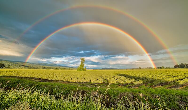
Here’s an example of a responsive WordPress gallery created with FooGallery. No matter what device you’re using, you’ll see that the images adjust themselves to accommodate the size of the screen.


How to create a Responsive WordPress Gallery
With FooGallery, setting up a WordPress image gallery is simple. And the best part is that FooGallery is responsive! So you don’t need to do anything, apart from just creating your gallery. FooGallery then automatically adjusts your gallery images, based on the size of the screen from which it is being viewed.
Here are the steps you’ll need to follow:
Install FooGallery
If you haven’t already added the FooGallery Plugin to your website, do this now. Go to your Dashboard, and select Plugins -> Add new. Search for FooGallery, then hit Install and Activate.
If you want to get started straight away with FooGallery PRO, then you can either download the free version and upgrade. Or you can install the premium version by following these steps.
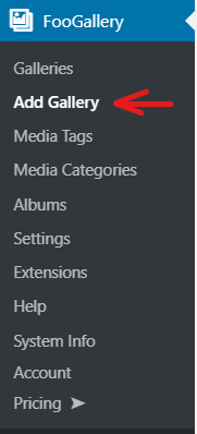
Create a Gallery
Once FooGallery is installed, it will appear in your Dashboard menu. You can create a new gallery by selecting Add Gallery from the FooGallery menu.
You’ll then be directed to new gallery page from which you can add a title, select your photos or videos, and adjust your gallery settings.
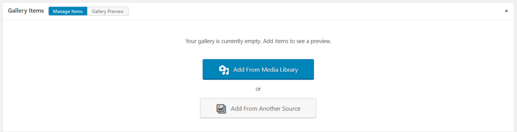
Select Media
The first step when creating a gallery is choosing the images you want to add. To do this, you need to select an option for adding media. FooGallery Free will allow you to upload images to your media library, or select images already in your library. For either of these options, select Add From Media Library.
FooGallery PRO will allow you to add images or videos from your library, by selecting the Media Library option. You are also able to add from another source, such as your Media Tags or Adobe Lightroom, by selecting the second option in the Gallery Items panel.
As each image is added, you’ll see an option on your right hand side to add titles, captions, alt text and descriptions. Fill these in, as they help categorize your images and improve your SEO.
You’ll also be able to reorder your images in the Manage Items tab, by using the drag and drop ability. This is useful if you’re providing step-by-step instructions or simply want your images to appear in a particular order. But take note that you’ll only be able to do this if you’re adding items from your library, not from an alternate datasource.
Choose Gallery Layout
You can now work on the appearance of your gallery. The first setting you need to select is your gallery layout, following which you can adjust the settings for that layout. You’ll find the various layouts under the Gallery Settings.
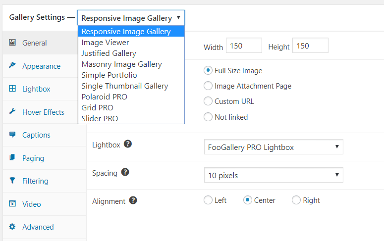
The Responsive Image Gallery gives you a grid layout with uniform thumbnails, which open to the full size images in the lightbox. While this is the default template, it’s worth noting that all of FooGallery’s templates are responsive, in that they will all adjust to fit the screen size. In other words, no matter which gallery layout you use, you’ll get a responsive WordPress gallery.
If you want to try a different template, there are several to choose from. Note that the PRO templates are available for FooGallery PRO only. If you decide later on that you’d prefer a different template, you can always change both your template and settings.
Style Your Gallery
The settings allow you to change the appearance of your thumbnails, the hover effect and items like the display of captions. You can adjust these to suit your needs.
As you change your settings, you can see the result in the Gallery Preview tab in the Gallery Items panel. This will give you a good idea of how your gallery will appear on the frontend, without actually having to leave the gallery page.
Add To Post
Once you are happy with the appearance, you can add your gallery to your post or page. The easiest way to do this is by adding the FooGallery block in the Gutenberg editor. From here, you’ll be able to choose the gallery you want to appear on your post or page. You’ll also see a preview of that gallery in the editor.
If you are using the classic editor still, you can add you gallery to your page by copying the gallery shortcode into your page. The shortcode appears in the gallery, in the right hand menu, just below your publishing options. Alternatively, you can find it on the Galleries page.
Hit Publish!
All that’s left now is for you to publish your post or page and see the gallery in action. Simple!
Summing Up
Using a responsive WordPress gallery really is an effective way to display your images. It’s also easy to create and use beautiful galleries on your WordPress site. The important thing to remember is that your galleries should be responsive.
If you’re looking for a WordPress gallery plugin, be sure to use one that is responsive. This capability ensures a happy user experience, while letting the search engines know that your site is mobile-friendly.