
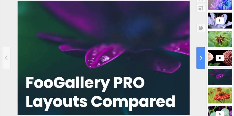
FooGallery PRO Starter gives photographers and visual creators six premium gallery layouts: Grid PRO, Slider PRO, Polaroid PRO, Spotlight PRO, Mosaic PRO, and Wall PRO. Each one gives your images a different kind of presentation, from polished portfolio grids to focused image showcases.
The best layout depends on the story you want your gallery to tell. A wedding photographer might want a romantic Polaroid-style recap. A commercial photographer may need a clean grid for client browsing. A travel photographer may prefer a slider that moves visitors through a selected sequence. This guide compares all six PRO Starter layouts and links to a live demo for each one.
Key
Key takeaway
Choose the layout by the viewing experience you want
- Use Grid PRO when visitors should browse several images at once.
- Use Slider PRO when you want to guide them through a curated set.
- Use Polaroid PRO when the gallery should feel warm and editorial.
- Use Spotlight PRO when one large image should take center stage.
- Use Mosaic PRO for varied tiles with larger favorites.
- Use Wall PRO for an animated collection with optional fullscreen browsing.
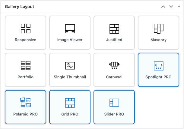
Quick Comparison
| Layout | Best for | What visitors experience | Demo |
|---|---|---|---|
| Grid PRO | Portfolio galleries, client proofing galleries, image collections, and visual archives. | A clean grid of thumbnails with a larger inline preview when an image is selected. | View Grid PRO demo |
| Slider PRO | Featured shoots, product angles, curated collections, and visual storytelling. | One featured image at a time with thumbnail navigation for moving through the set. | View Slider PRO demo |
| Polaroid PRO | Weddings, events, travel stories, lifestyle shoots, and informal galleries. | Framed photo cards with visible captions and a relaxed printed-photo style. | View Polaroid PRO demo |
| Spotlight PRO | Hero image showcases, product visuals, featured collections, and landing page sections. | A large inline image viewer with arrows and dot navigation. | View Spotlight PRO demo |
| Mosaic PRO | Mixed portrait and landscape collections, travel stories, and creative portfolios. | A varied tiled gallery with larger favorites and adjustable density and gaps. | View Mosaic PRO demo |
| Wall PRO | Visual landing pages, portfolio introductions, and hero backgrounds. | Drifting photo columns with optional fullscreen browsing and a lightbox. | View Wall PRO demo |
Grid PRO Layout
Grid PRO is the strongest choice when visitors need to browse a collection quickly. It keeps the familiar gallery grid (see the screenshot below), but gives the presentation a more polished feel. Visitors can scan the thumbnails, select an image, and view a larger version without losing their place in the gallery.
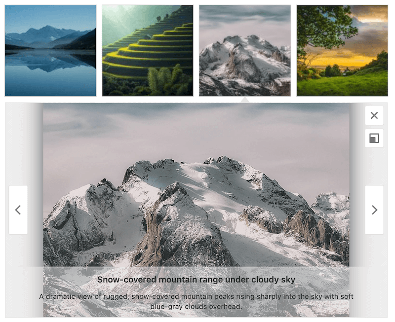
This makes Grid PRO especially useful for photography portfolios, client galleries, event galleries, and larger collections where people may want to compare several images before opening one in detail.
- Best for: portfolios, proofing galleries, image archives, and collections with many photos.
- Why photographers use it: it gives clients a fast overview while still making selected images feel important.
- Useful options: thumbnail size, spacing between images, number of columns, caption position, and the larger preview area.
- Watch out for: very long captions can make a clean grid feel busy, so keep caption text focused.
Slider PRO Layout
Slider PRO is designed for a focused, one-image-at-a-time experience. Instead of showing the whole collection at once, it gives one photo the main stage and lets visitors move through the gallery with simple navigation. Here’s a screenshot.

This works well when the order of the images matters. For example, you might use Slider PRO to show a styled product shoot, a portrait session, a before-and-after series, or a short collection of highlight images from a larger gallery.
- Best for: featured work, image sequences, product angles, and smaller curated sets.
- Why photographers use it: it slows the viewer down and gives each selected image more attention.
- Useful options: image ratio, thumbnail navigation, captions, lightbox behavior, and how each image fits the viewing area.
- Watch out for: it is not the best choice when visitors need to compare many images at once.
Polaroid PRO Layout
Polaroid PRO gives your gallery a framed, printed-photo look. It feels more relaxed than a standard grid and works well when you want the gallery to feel personal, tactile, or story-led. Here’s a quick example.
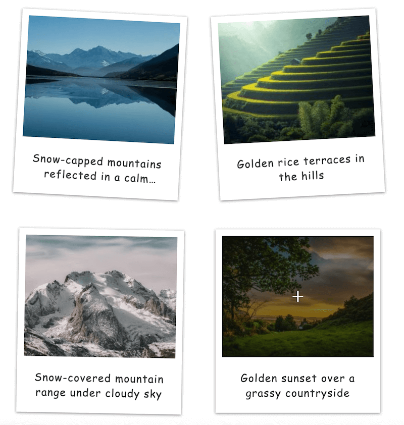
The visual style is especially strong for galleries that should feel like memories rather than catalog entries: weddings, travel stories, events, family sessions, lifestyle shoots, behind-the-scenes collections, and creative portfolios with a softer tone.
- Best for: weddings, travel, lifestyle, events, personal projects, and editorial photo stories.
- Why photographers use it: it adds charm and warmth without needing a custom design.
- Useful options: thumbnail size, spacing, gallery alignment, caption position, and lightbox choice.
- Watch out for: the playful look may not suit formal commercial galleries or minimal brand pages.
Spotlight PRO Layout
Spotlight PRO puts one image in the spotlight while keeping the gallery embedded in the page. Visitors can move through the images with arrows and dot navigation, but the experience stays focused on a large central image.
This layout is useful when the gallery should feel like a featured section rather than a traditional thumbnail gallery. It can work well near the top of a portfolio page, on a product or service page, or anywhere you want a selected image to lead the page visually.
- Best for: hero sections, featured collections, product visuals, and portfolio highlights.
- Why photographers use it: it keeps attention on one strong image while still allowing visitors to browse the rest.
- Useful options: image size, alignment, arrow style, dot position, rounded corners, and background color.
- Watch out for: it is less useful for large galleries where visitors need to scan many thumbnails quickly.
Mosaic PRO Layout
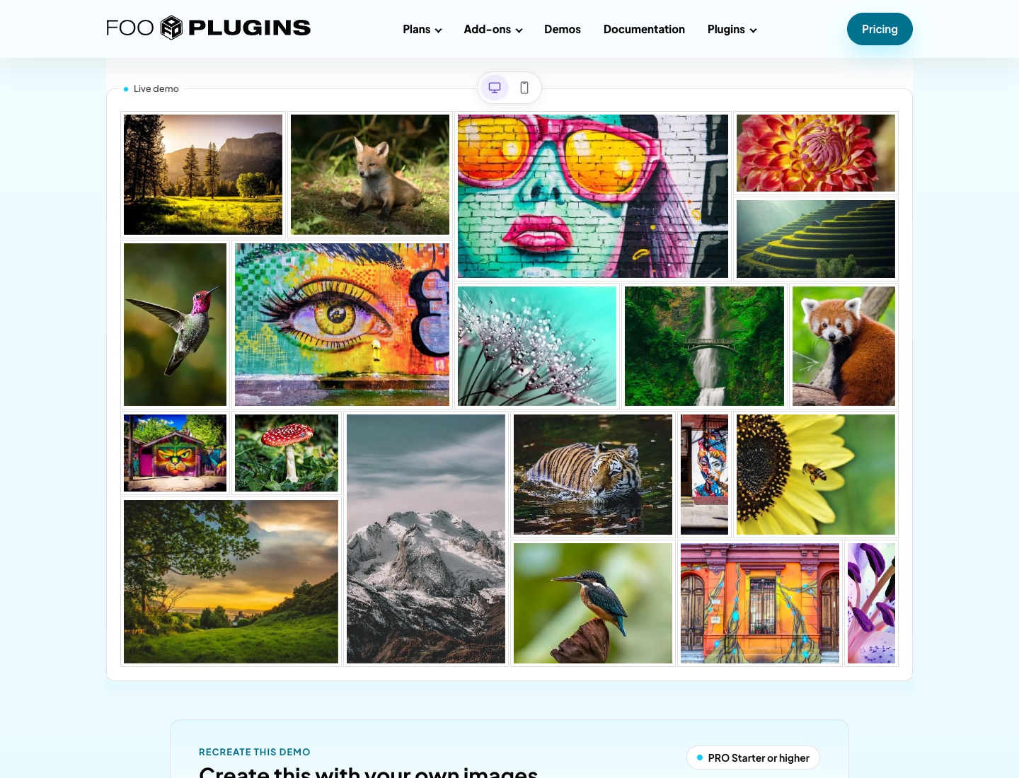
Mosaic PRO arranges photos in varied tiles, giving selected favorites more space. It suits mixed portrait and landscape collections where you want a visual overview with a less uniform rhythm than a standard grid.
Use Tile Density and Thumbnail Gap to control how compact the collection feels. Mark favorite images to influence which photos receive larger tiles, then let visitors open a photo in the lightbox.
- Best for: travel collections, event highlights, and creative portfolios.
- Watch out for: larger favorites draw more attention, so choose them deliberately and preview the balance on phones.
Wall PRO Layout
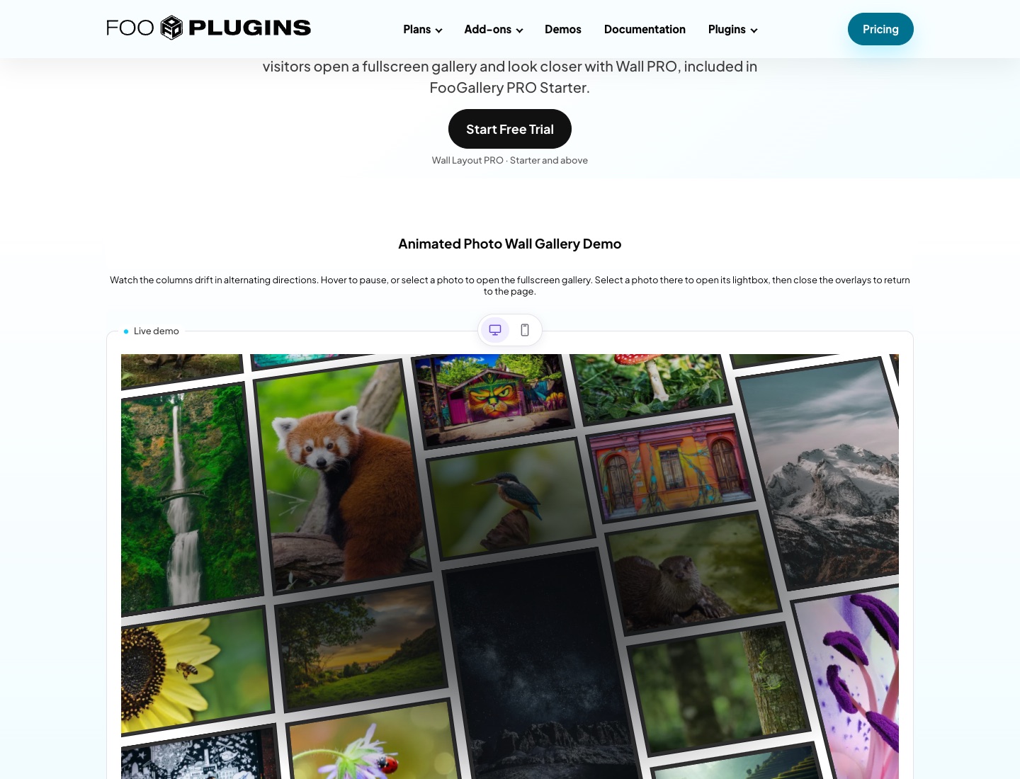
Wall PRO introduces a collection through animated columns of photos. Place it inline as its own gallery section or use Background position behind hero content.
Adjust columns, gaps, tilt, speed and direction to suit the page. Choose whether selecting a photo opens the lightbox or a fullscreen gallery. The demo opens fullscreen browsing first, with a lightbox available from there.
- Best for: portfolio introductions, visual landing pages, and hero backgrounds.
- Watch out for: keep overlaid text readable and check the mobile columns. Reduced-motion preferences can make the wall appear still.
Detailed Layout Comparison
| Question | Grid PRO | Slider PRO | Polaroid PRO | Spotlight PRO | Mosaic PRO | Wall PRO |
|---|---|---|---|---|---|---|
| Can visitors scan many images at once? | Yes. This is its main strength. | No. It is designed around one main image. | Yes, but in a looser framed-photo layout. | No. It keeps attention on one large image. | Yes. Tiles show a collection with larger favorites. | Yes. Drifting columns introduce the collection. |
| Does it feel formal or casual? | More formal and structured. | Focused and polished. | Warm, relaxed, and personal. | Modern and feature-led. | Varied and editorial. | Animated and immersive. |
| How does it handle captions? | Works best with short, useful captions. | Captions can support the active image. | Captions are part of the printed-photo feel. | Captions should be minimal so the image remains the focus. | Keep tile captions concise; use the lightbox for a closer look. | Prioritize the photos; use fullscreen browsing or the lightbox for a closer look. |
| Best first adjustment | Columns and thumbnail spacing. | Image ratio and thumbnail navigation. | Thumbnail size and caption position. | Image size, arrows, dots, and background. | Tile density, thumbnail gap, and favorites. | Position, columns, speed, and photo-click behavior. |
| Best use case | A client or portfolio gallery with many images. | A curated sequence of selected images. | A story-led gallery with personality. | A featured gallery section built around a strong image. | A mixed collection with selected highlights. | A moving portfolio introduction or hero background. |
Tip
Quick decision
Start with the type of gallery you are building
If it is a broad portfolio or client gallery, start with Grid PRO. If it is a short story or selected set, use Slider PRO. If the images should feel personal and memorable, use Polaroid PRO. If the gallery is part of a landing page or hero section, use Spotlight PRO. Choose Mosaic PRO for varied tiles with larger favorites, or Wall PRO for a moving introduction to your collection.
Which PRO Layout Should You Choose?
For most photography portfolios, Grid PRO is the safest starting point. It is familiar, easy to browse, and polished enough for client-facing pages.
Choose Slider PRO when you want to slow the visitor down and guide them through a specific sequence. It is a good fit for highlights, case studies, product angles, and smaller curated sets.
Choose Polaroid PRO when the mood matters. It works beautifully for images that should feel like moments: weddings, travel, events, family photography, lifestyle shoots, and creative projects.
Choose Spotlight PRO when one image should lead the page. It is ideal for a strong featured image, a product showcase, or a portfolio section where you want the viewer’s attention focused immediately.
Choose Mosaic PRO when a mixed collection needs rhythm and emphasis. Larger favorites help lead the eye while the other tiles give visitors an overview.
Choose Wall PRO when the collection should introduce a page through motion. Use it inline or behind your own hero content, with optional fullscreen browsing.
Why upgrade
What PRO Starter adds
- Six premium layouts for different types of photography galleries.
- More control over layout, spacing, captions, navigation, and image focus.
- Polished presentations for portfolios, client galleries, stories, and featured image sections.
What to watch
Match the layout to the mood
- A slider can hide too much if clients need to compare many images.
- A playful Polaroid layout can feel too casual for formal commercial work.
- A Spotlight layout can feel too narrow for large proofing galleries.
See All Six Demos
Next step
Give your photography galleries a more polished presentation
FooGallery PRO Starter includes Grid PRO, Slider PRO, Polaroid PRO, Spotlight PRO, Mosaic PRO, and Wall PRO, so you can choose a gallery style that matches the images, the client, and the page.
Evidence and proof
Source: FooGallery product data maintained by FooPlugins.
Source links
Source: FooGallery product data maintained by FooPlugins.
FooGallery is owned and maintained by FooPlugins. When we mention or recommend FooGallery in this article, that relationship may influence how the product is covered; product details should be checked against current documentation, demos, pricing, and release notes.
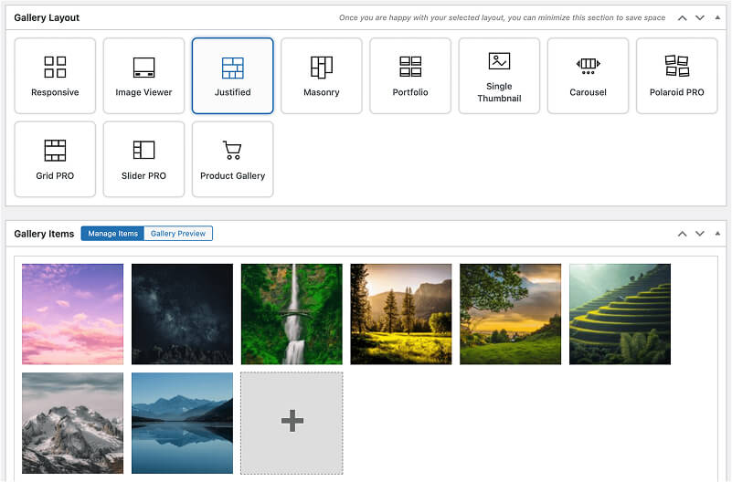
FooGallery WordPress gallery plugin
The Best WordPress Gallery Plugin
Create polished photography galleries with premium layouts for portfolios, client galleries, image stories, and featured showcases.