
![[Update] FooGallery PRO 3.3.3: Design Better Galleries for Mobile](https://fooplugins.com/wp-content/uploads/2026/09/FooGallery-mobile-update.jpeg)
More of your visitors are browsing on a phone than ever before, but a gallery that looks great on desktop doesn’t always translate neatly to a smaller screen. That’s the problem FooGallery PRO 3.3.3 sets out to solve.
This release introduces Mobile Gallery Settings, giving you direct control over how your galleries look and behave on mobile devices, without touching your desktop design. Alongside that headline feature, you’ll also find more flexible Bulk Copy tools, improved Divi support, safer caption handling, and a handful of compatibility and frontend fixes.
Let’s take a look at what you can expect from the latest FooGallery release.
A Gallery Built for Every Screen
Quick Note
FooGallery Requirements
Mobile Gallery Settings are available in the FooGallery PRO Starter plan and higher.
One Setting, Two Experiences
Previously, most gallery settings applied equally across every screen size. You could build a responsive gallery, but tweaking a setting for mobile often meant changing it for desktop too.
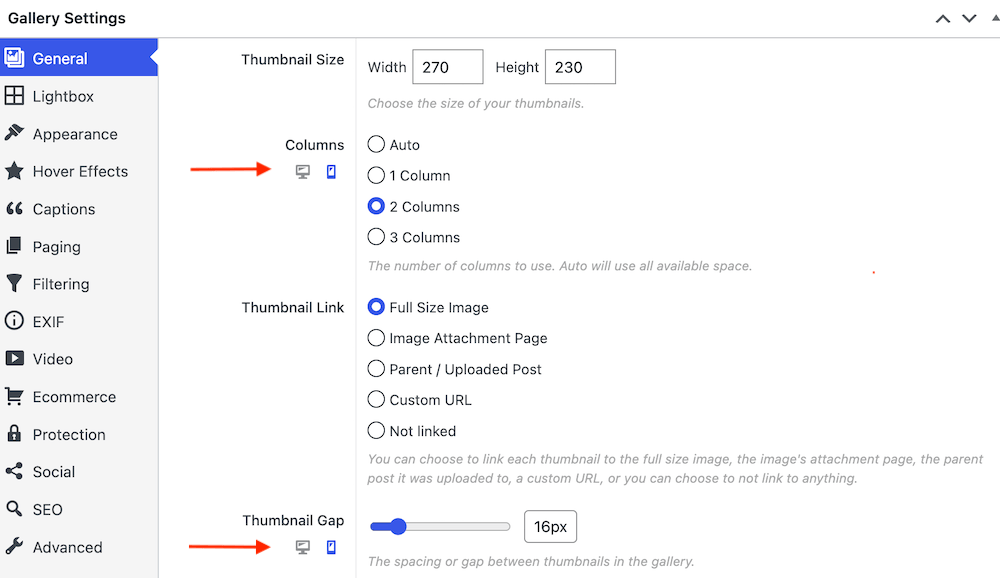
With Mobile Gallery Settings, you can now tailor supported layouts specifically for smaller screens: columns, spacing, captions, navigation, and more, depending on the layout you’re using. That means you can keep a spacious, image-led gallery on desktop while switching to a tighter, easier-to-navigate layout on mobile.
Take a look at the mobile gallery settings demo.
You Don’t Have to Configure Everything Twice
Every mobile setting can simply inherit its desktop value by default. You only need to step in with a mobile override when you want the smaller-screen experience to be different, say, four columns on desktop but two on mobile (as in the screenshot below), or navigation arrows on desktop and pagination dots on mobile.
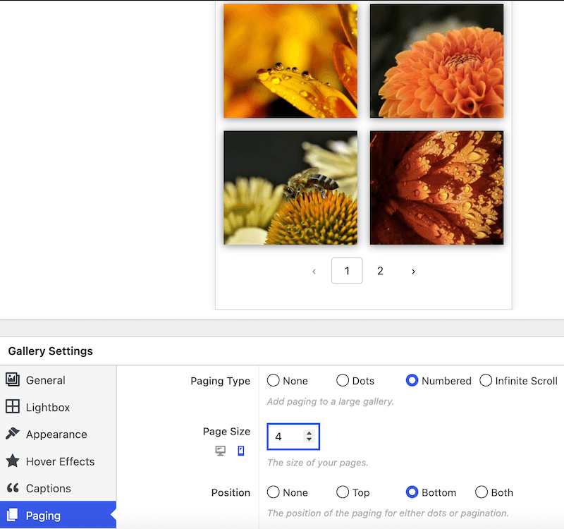
Update an inherited desktop setting later, and the mobile layout follows automatically. Any overrides you’ve deliberately set stay independent, exactly as you configured them.
Preview Your Changes as You Go
The gallery editor now includes an improved mobile preview, so you can switch between desktop and mobile views right while you’re configuring a gallery:
- Set your desktop value as usual.
- Switch to the mobile preview.
- Choose whether the mobile setting should inherit the desktop value or use its own.
- Adjust and see the result immediately.
- Save or update the gallery.
The preview also refreshes template classes, responsive options, and generated CSS more reliably as you make changes.
Mobile Setting Updates – Layout by Layout
Responsive Gallery
The familiar mobile column control is still here, now paired with a clearer desktop-and-mobile editing workflow. Combine your chosen mobile column count with mobile-specific spacing (available from PRO Starter) whenever desktop thumbnails start feeling too narrow or crowded on a phone.
Masonry Gallery
Masonry galleries now offer more control over mobile layout. You can switch to a different layout family, thumbnail width, or gap on mobile while keeping your desktop configuration untouched. For example, taking a fixed-width desktop Masonry gallery down to one, two, or three columns on mobile. This release also fixes a frontend issue where Masonry’s hidden sizing elements could cause horizontal page overflow.
Justified Gallery
Justified galleries can now use a different target row height and spacing on mobile. Shrink the row height to show more of the gallery at once, or increase it to make individual images easier to view and select; your desktop sizing stays exactly as it was.
Carousel
Simplify carousels for smaller screens by controlling the maximum number of visible items, thumbnail spacing, arrows, and pagination dots. For example, show several items with arrows on desktop, then switch to a single larger item with pagination dots on mobile.
Captions and Pagination
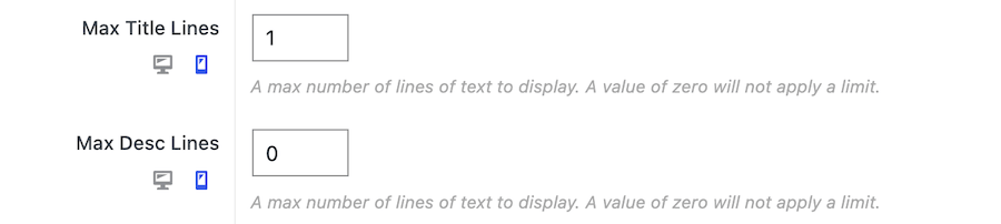
These shared settings get mobile controls too. Adjust caption alignment and set separate title and description line limits for mobile (see below), so that long captions don’t take over a phone screen. Pagination can also use a smaller mobile page size and more compact numbered navigation.
PRO Layouts Get Their Own Mobile Options
- Slider: choose a mobile-specific aspect ratio.
- Spotlight: control autoplay and pagination-dot position.
- Grid: adjust maximum columns, panel visibility, default panel state, and aspect ratio.
- Polaroid: use different spacing on mobile.
Available controls depend on the layout and your FooGallery PRO plan.
Galleries That Respond in Real Time
FooGallery now detects when a screen crosses the mobile breakpoint and refreshes the gallery with the right configuration — no page reload needed. This comes in handy when a visitor rotates their phone or tablet, resizes a responsive browser window, or previews a page in a builder that toggles between desktop and mobile.
Quick Note
All Gallery Layouts Are Still Responsive
FooGallery’s new mobile settings provide added control for mobile devices, but all layouts still remain responsive. This change will not impact gallery responsiveness or how galleries currently display on mobile devices.
More Efficient Ways to Work
Flexible Bulk Copy Tools
FooGallery PRO Expert users can now copy settings between galleries using clearly defined sections: copy everything, or just the groups you need, such as appearance, hover effects, captions, paging, SEO, or colors. Unrelated settings on the target gallery are left untouched. It’s a great way to build a family of galleries that share a visual style without rebuilding every configuration by hand.
This release also fixes an issue where the “None” hover icon choice could be lost when copying Hover Effects settings.
Improved Divi Support
FooGallery now includes dedicated Divi Builder compatibility, with automatic asset loading in Divi previews, a gallery-selection module, support for galleries embedded in Divi content, and more reliable rendering across classic and visual builder workflows. Existing FooGallery shortcodes in Divi content should continue to work as before.
Under-the-Hood Improvements
- Polylang Media fix: Gallery attachments no longer disappear from the FooGallery block preview when Polylang Media translations are enabled, while still respecting your explicitly selected Media Library attachments.
- Safer captions and custom data: Captions and descriptions are cleaned more consistently before display, so normal text and supported formatting still work while malformed or unsafe markup is removed. Public shortcodes can no longer override the developer-only Custom Settings field.
- Thumbnail fallback for delayed scripts: A new fallback keeps gallery images visible until FooGallery’s JavaScript finishes initializing, which helps on sites that delay JavaScript for performance. If it conflicts with a heavily customized design, it can be disabled under FooGallery → Settings → Advanced → Gallery Loading & Compatibility.
Troubleshooting FAQs
Can I update straight from 3.2.6 to 3.3.3?
Yes, most sites can update directly. No destructive gallery database migration is performed, but we still recommend taking a current backup and testing your important galleries on a staging site first.
Do I need to clear my caches after updating?
Yes. FooGallery’s frontend CSS and JavaScript assets changed in this release, so clear your WordPress page cache, JS/CSS optimization cache, hosting or server cache, CDN cache, object cache, and browser cache. Then check the page in a private or incognito window.
How do I confirm PRO is active after updating?
Open FooGallery → System Info and check that FooGallery reports version 3.3.3, your expected PRO plan is active, your licence is connected to the correct website, and your PRO layouts and features are available.
What should I check on my existing galleries?
Review important galleries using the new mobile preview, especially any using Masonry, Justified, Carousel, Slider, Spotlight, Grid, or PRO Portfolio. If you have an older Responsive Gallery with no stored Mobile Columns value, it may now default to two columns on mobile — edit the gallery and set the mobile Columns option to Auto to restore automatic sizing.
My gallery is showing blank. What do I do?
Temporarily disable JavaScript delay, defer, combination, and minification. If that resolves it, exclude FooGallery’s scripts from that optimization tool. You can also enable Force Legacy Runtime Loading under FooGallery → Settings → Advanced → Gallery Loading & Compatibility.
Why do I briefly see thumbnails flash before the gallery loads?
That’s the new thumbnail fallback working as intended. It briefly displays images while the gallery initializes. To disable it, enable Disable No-JavaScript Thumbnail Fallback under the same Gallery Loading & Compatibility settings. Note that with it disabled, thumbnails may stay hidden if the gallery fails to initialize.
My captions look different. Why?
Check the affected Media Library title, caption, description, and any custom gallery caption override. Ordinary text and supported HTML should look the same, but malformed or unsafe markup may now be stripped out.
Media folders aren’t showing up where I expect them. Why?
The PRO media folder sidebar now only appears in FooGallery-owned media-selection windows by default. If you relied on it appearing in every WordPress media modal, check the Media Folders compatibility settings and enable the option to display it everywhere.
My Divi preview won’t load. What should I try?
Clear Divi’s generated CSS and builder caches, reload the Visual Builder, and reselect the gallery in the FooGallery module. It’s also worth temporarily disabling JavaScript delay or combination to rule out an optimization conflict.
A custom integration I built has stopped working, what changed?
Custom code may need a review if it modifies internal FooGallery JavaScript objects, keeps references to a gallery after initialization, alters gallery field definitions, depends on translated settings-section names, supplies undocumented Custom Settings values, or overrides generated gallery markup or responsive CSS classes. It’s also worth updating any third-party FooGallery extensions before testing.
I’m still stuck. What should I send to support?
Contact our support team. Please include:
- Your FooGallery version and PRO plan, WordPress and PHP versions
- The affected gallery layout
- A link to the affected page or staging site
- Whether the issue happens on desktop, mobile, or both
- The approximate screen width where it occurs
- Your caching/CDN/lazy-loading/optimization tools, any related page builder, multilingual, ecommerce, or media plugins
- Relevant details from FooGallery → System Info
- And screenshots, a screen recording, or any browser-console errors.
Never include passwords, licence keys, API credentials, or other secrets in an unsecured message.
Ready to Upgrade?
FooGallery PRO 3.3.3 gives you real control over the experience your mobile visitors get, without disturbing the desktop designs you’ve already built. Update FooGallery PRO, clear your caches, and open the mobile preview on one of your existing galleries to start tailoring it for smaller screens.
If you’re a FooGallery Free user and want to try the mobile settings, start a free trial of FooGallery PRO Starter today.