Three is a magical number in design. Just think of the rule of thirds in photography, or the rule of three in interior design, both of which allow you to create a sense of balance and order. This can be applied to web design as well, by using 3 images in a row in a grid-style layout.
However, aligning images in WordPress can be tricky and can sometimes require workarounds. So we’re going to show you three effective methods for displaying images in a perfect row (with no coding required). All three methods work with any WordPress theme and will maintain proper alignment across desktop and mobile devices. Plus, for those of you who frequently create image galleries, we’ll cover options that save time as well as one-off solutions.
The Challenge of Displaying 3 Images in a Row in WordPress
Before we discuss potential solutions, it’s necessary to understand where the challenge lies. The WordPress Gutenberg Editor and page builders like Elementor sometimes make it difficult to maintain consistent spacing between images, which can cause issues with responsive layouts on mobile devices. This becomes even more difficult when trying to place three images in a row, which is a crucial design element known as the rule of thirds.
“When images are displayed in a perfect three-column arrangement, they naturally guide the visitor’s eye across the page in a predictable pattern, improving engagement and content retention. Failing to properly align images in WordPress undermines the visual storytelling that makes great web design effective.”
Steve Usher, Developer at FooPlugins.
Furthermore, the default WordPress Gallery Block often doesn’t provide enough control over exactly how many images appear per row, especially when images have different dimensions or aspect ratios. While WordPress offers some built-in options (which we’ll cover in Methods 1 and 2), they often require workarounds or don’t provide the precise control many users need.
This is why many WordPress users prefer a more specialized solution in the form of a plugin such as FooGallery. This offers customized grid templates designed specifically to solve this problem, allowing for exact control over image rows while maintaining responsive behavior across all devices.
Method 1: Using the WordPress Gallery Block
The Gallery Block is perhaps the simplest native WordPress solution for creating image rows without plugins or coding, and it can be accessed via the standard WordPress block editor.
To do this, you can follow the steps below:
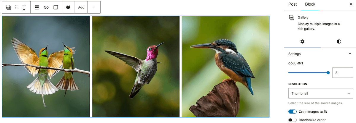
- Add the Gallery Block as a new element on the page – search for gallery in the block directory and click on this to add to the page.
- Upload the three images that you want to show in a row (or choose existing images from the media library).
- Selecting 3 images will create a 3-column image gallery with your chosen images; however, you can navigate to the Gallery, which will open the block panel on the right, from where you can manually set the number of columns. You can also experiment with horizontal and vertical spacing between images in the ‘Styles’ section of the block settings.
While this is the simplest approach, it does come with some limitations.
- Images with different dimensions can cause uneven rows or thumbnails. You can use the “Crop images” setting to create uniform thumbnails, but you won’t have control over how the image is cropped.
- On mobile devices specifically, the three-column layout will typically collapse to a single column, which you may not want.
- Moreover, different WordPress themes may override spacing settings.
As we’ve seen, the Gallery Block does offer a basic three-image layout. However, users seeking precise control over how images display across all devices might find FooGallery’s responsive grid layout more reliable.
Method 2: Creating Image Rows with Column Blocks
The second option is to use the Columns Block to add your three images in a row. This is another native WordPress block and will allow you to add media in up to six side-by-side columns, which can be used to create an image grid effect.
You can set this up using the following steps:
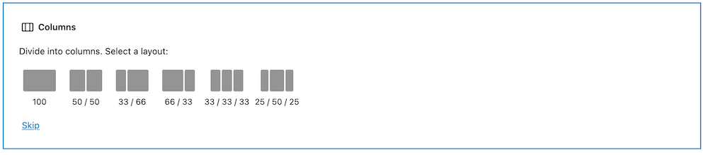
- Click the “+” button in the WordPress block editor, search for “Columns”, and select this block.
- Select the three-column layout option, represented as 33/33/33 in the column block.
- Click inside each column, press “+”, and insert an Image Block into each. Then, upload your chosen images to each block or select images from the media library.
- The basic columns block doesn’t allow you to adjust the dimensions of the columns (however, a more advanced block-based plugin would probably allow you to modify padding and margins between columns), but you can adjust each individual column’s width. Alternatively, you can change the aspect ratio of the images.
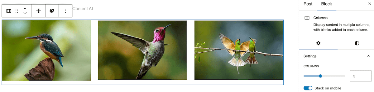
The Columns Block has a ‘Stack on mobile’ setting, differentiating it from the Gallery Block, which helps to prevent layout issues on smaller screens. With this method, you can also display individual captions beneath each image or add other blocks or info to each column.
However, while this option gives you a little more control than the first method, it’s a time-consuming method. This is further compounded if images need to be cropped, as you will either need to ensure all images are the same dimension before uploading, or you will need to crop each one individually. Plus mobile responsiveness may still not work, depending on your theme or setup – unlike the next option we’ll cover.
Method 3: Using FooGallery for Perfect Image Grids
The final method is to use a dedicated gallery plugin: FooGallery excels at creating a variety of precise image layouts, including the perfect 3-image row.
FooGallery includes multiple gallery templates, each of which supports creating consistent image rows with proper alignment and spacing. The FooGallery PRO versions feature even more gallery templates, such as Grid PRO.
Here’s how to create a 3-image row grid with FooGallery:
- Once the plugin is installed and activated on your website, add a new gallery in FooGallery and upload your three images or add them from the media library.
- Select the ‘Grid PRO’ layout template from the dropdown of gallery layouts (note that you will need at least the FooGallery PRO Starter plan for this layout).
- In the layout settings, configure the number of columns to 3. You can also set the exact dimensions that you want for the gallery thumbnails – each of the images will automatically crop to these dimensions. However, the full-size images will still be visible when clicked on by your users.
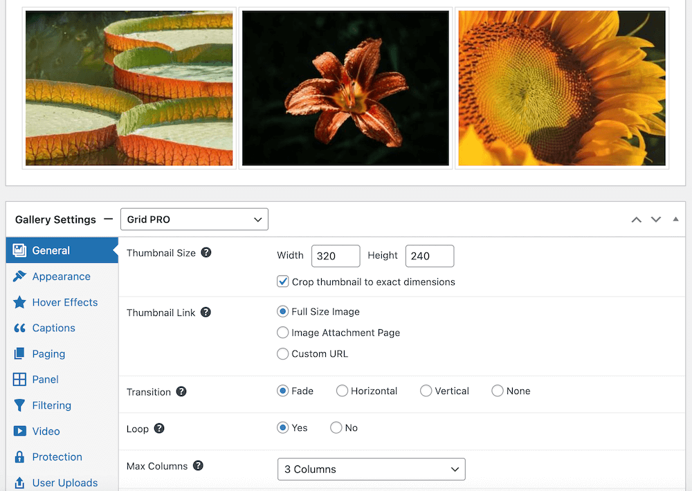
- Next you can customize the gallery settings like spacing, image borders, transition settings, and hover effects. You can also add captions to your images. This will give you full control over your gallery’s appearance, without having to add custom CSS.
- Save your gallery and insert it into your page using the provided shortcode or the FooGallery block.
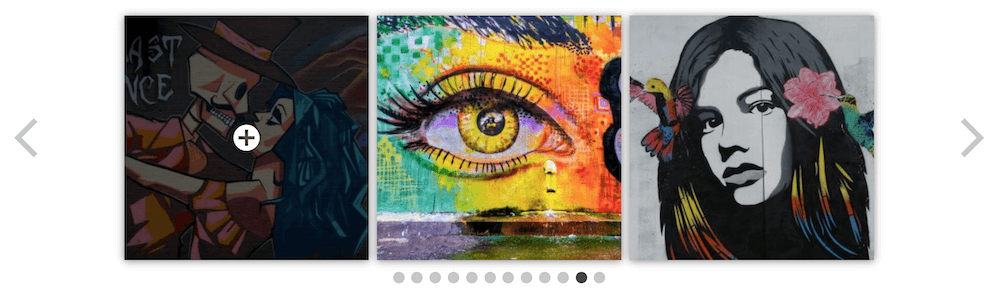
Here’s the end result:


Unlike the Gallery Block, FooGallery maintains consistent spacing and alignment between images automatically, even when images have different dimensions – meaning you don’t have to manually crop or resize them.
FooGallery also handles image loading more efficiently, which helps maintain your page performance while displaying multiple images. The plugin works reliably across different themes and WordPress updates, providing a more stable solution than native WordPress blocks. FooGallery supports videos, lightboxes, and captions for each image, which can dramatically upgrade the capabilities of your image galleries
Transform Your WordPress Site with Professional Image Layouts Today
Using three images in a row can help to create a visually appealing and engaging element on your page or post. Structured image layouts can also improve content hierarchy and user navigation patterns across all devices – so it’s really a no-brainer.
As we’ve discussed in this article, there are various options for laying out three images in a row. But it’s clear that FooGallery is the best option for those who want to maintain an aesthetically pleasing site and have more control over image display (without all of the hard work). FooGallery offers a range of templates designed for creating professional image rows without coding.
If you frequently create image galleries, or want the benefit of a perfectly presented 3-image row, FooGallery PRO is an excellent option. With it’s additional layout options like the Grid PRO gallery template and more customization features, you can easily create effective galleries for your WordPress website.
Get started now with FooGallery PRO!
The Best WordPress Gallery Plugin
FooGallery is an easy-to-use WordPress gallery plugin, with stunning gallery layouts and a focus on speed and SEO.