Building landing pages without inspiration can be a challenge. Ideally, you want your landing pages to be a balance of compelling design, persuasive copy, and seamless functionality – all tailored to a specific audience and goal. Achieving this is not always easy.
However, by looking at examples that highlight specific conversion elements and practical implementation steps, it becomes easier to create your own WordPress landing pages. In this article, we’ll explore 10 diverse WordPress landing page examples across ecommerce, SaaS, service businesses, and more. Hopefully by the end of this, you will be inspired to create effective and compelling landing pages for your site.
Why WordPress Landing Pages Matter for Conversions
According to the Landingi analysis of 25,000 landing pages there is a strong link between good design elements and positive conversion outcomes. These elements could include things like the length of the copy, the use of images and/or video, and the number and position of buttons.
Given the flexible nature of WordPress, as well as its numerous page builders, anyone can create targeted landing pages without developer skills, while incorporating multiple design elements into the page. WordPress landing pages can be enhanced with strategic conversion elements at critical moments in the user journey, such as with a plugin like FooConvert.
Businesses investing in paid traffic need dedicated landing pages to maximize their marketing ROI. These targeted pages are designed to convert visitors by aligning closely with the ad’s message and intent. They therefore help reduce bounce rates, increase engagement, and drive more qualified leads or sales by offering a focused and relevant user experience. Without them, businesses risk wasting ad spend on traffic that doesn’t convert.
The Essential Elements of High-Converting Landing Pages
In general, high-converting landing pages will incorporate a number of essential elements. When creating your landing pages, it is advisable to include as many of these as possible:
- Headlines: When using WordPress page builders or Gutenberg blocks, you can create compelling headlines with proper H1 tags, which is important for both SEO and conversion impact. You should also test different headline variations to establish which is more effective for conversions.
- Copy placement: You can use strategic content block positioning and formatting techniques to highlight your copy, which should focus on the benefits of the product or service that you’re selling. As WordPress allows you to use columns, tabs, or toggles, you can organize information without overwhelming visitors.
- CTAs: implementing high-converting CTA buttons is another important factor. There are various ways to do this, such as by using either theme customization or page builder elements, or FooConvert’s popup and flyout widgets for perfectly timed call-to-action displays. Here’s an example from FooConvert.

- Social proof element integration: Social proof, like testimonials or reviews, can be highly beneficial and help to improve conversions, and it is worthwhile using a high-performing social proof plugin.
- Visual hierarchy in WordPress: To establish proper visual flow in WordPress, use themes, page builders, or even custom CSS to structure content hierarchically with clear headings, whitespace, and contrast, while emphasizing key elements. You can also create focal points – like bold call-to-action buttons or highlighted offers – using color, size, and positioning to naturally guide visitors toward your conversion goals.
- WordPress-specific performance optimization: While the visual appearance of a landing page is important, you also need to pay attention to performance. Be sure to implement things like caching, image optimization techniques, lazy loading, fast hosting, and so on, for optimal page performance. This is particularly relevant for landing pages where conversion is the priority or where SEO is a main marketing channel
10 Proven WordPress Landing Page Examples With Step-by-Step Build Guides
Now that we have a good understanding of why landing pages are so important and which elements they need to incorporate, let’s look at how different websites implement this. We’ve compiled a showcase of 10 diverse, high-converting WordPress landing page examples from across different industries. These are real-world examples with WordPress-specific builds, so you can draw inspiration for your own landing pages.
SaaS Landing Pages
SaaS Example #1: Sign-up Landing Page (Cello)
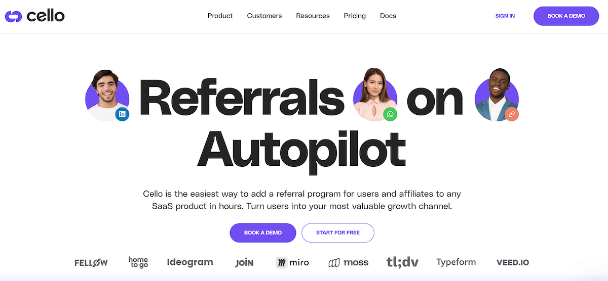
This WordPress landing page from SaaS company Cello demonstrates how large, persuasive copy with clear, contrasting color schemes can drive site visitors towards a demo or free trial. As you can see, ‘Book a Demo’ appears twice on the page, once in the header and again as part of the main hero section. In both instances, it is in purple to contrast against the white background and draw attention to it.
The page incorporates social proof with a list of companies that use the software. This appears just below the hero section, but above the fold, so it is immediately visible. Using the images of real people in the hero adds another element of social proof, making the brand more relatable and building trust. Seeing real faces humanizes the message, increases credibility, and helps potential customers envision themselves having a similar positive experience.
SaaS Example #2: Pricing/Plan Selection Page (Kalium)
The pricing page for WordPress theme builder Kalium features three pricing tiers in the column, with the preferred plan highlighted in blue with a ‘best deal’ banner. This immediately draws visitors’ attention to the mid-range plan, even though it is not the cheapest one available.
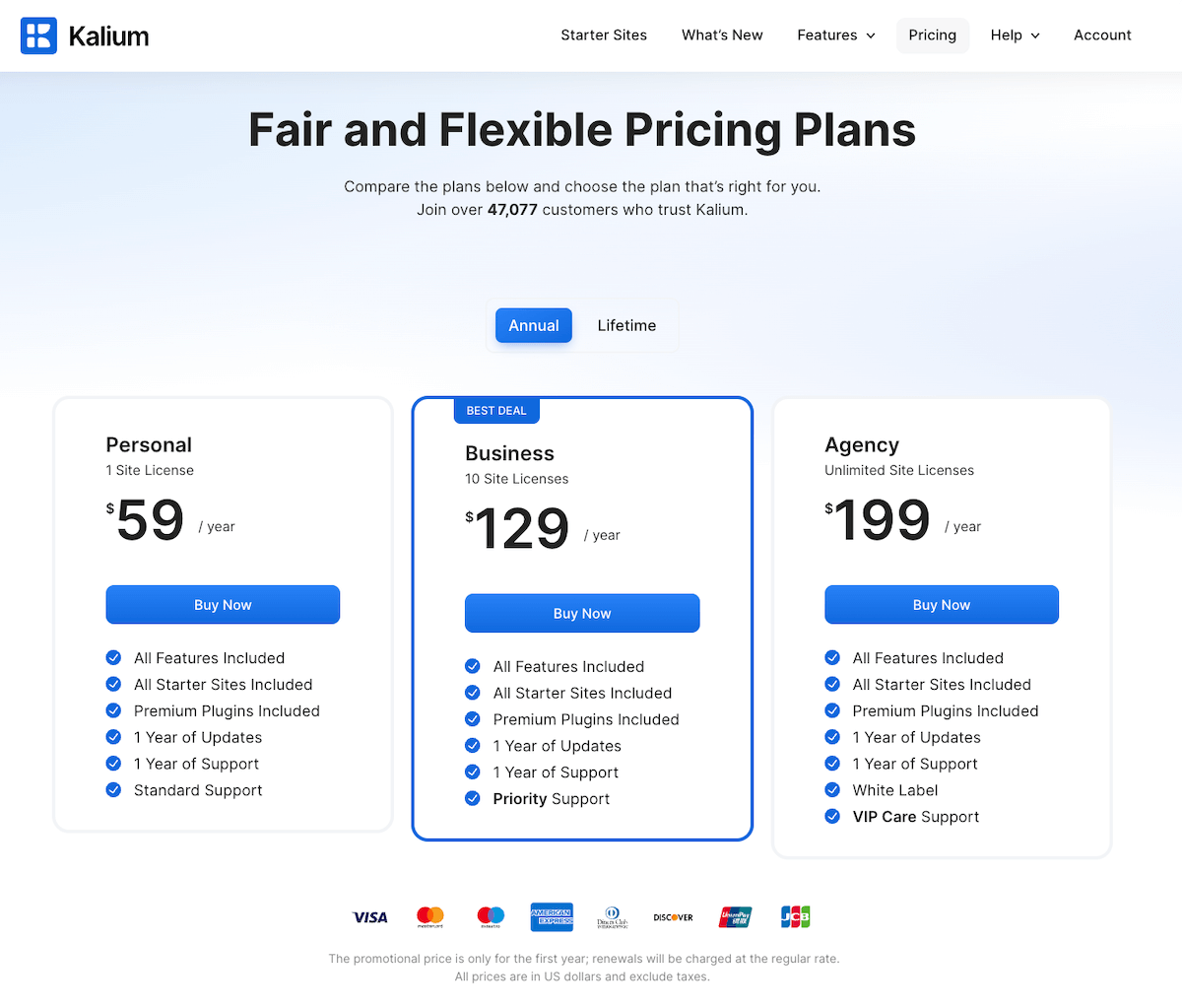
The page shows several trust signals like a 14-day money-back guarantee, the number of customers using Kalium and real user reviews. You’ll also see a strip showing brands that use the theme builder, all of which work as a form of social proof.
The landing page includes payment options and a disclaimer about the pricing, and finishes with an FAQ section to further address any questions or doubts. It finishes with a single block encouraging the reader to contact Kalium if they have any questions. By providing clear, reassuring answers, and an easy point of contact, you can help to build trust, reduce friction, and give potential customers the confidence to make a purchase.
Lead Generation Landing Pages
Lead Generation Example #1: Demo Booking Page (Lattice)
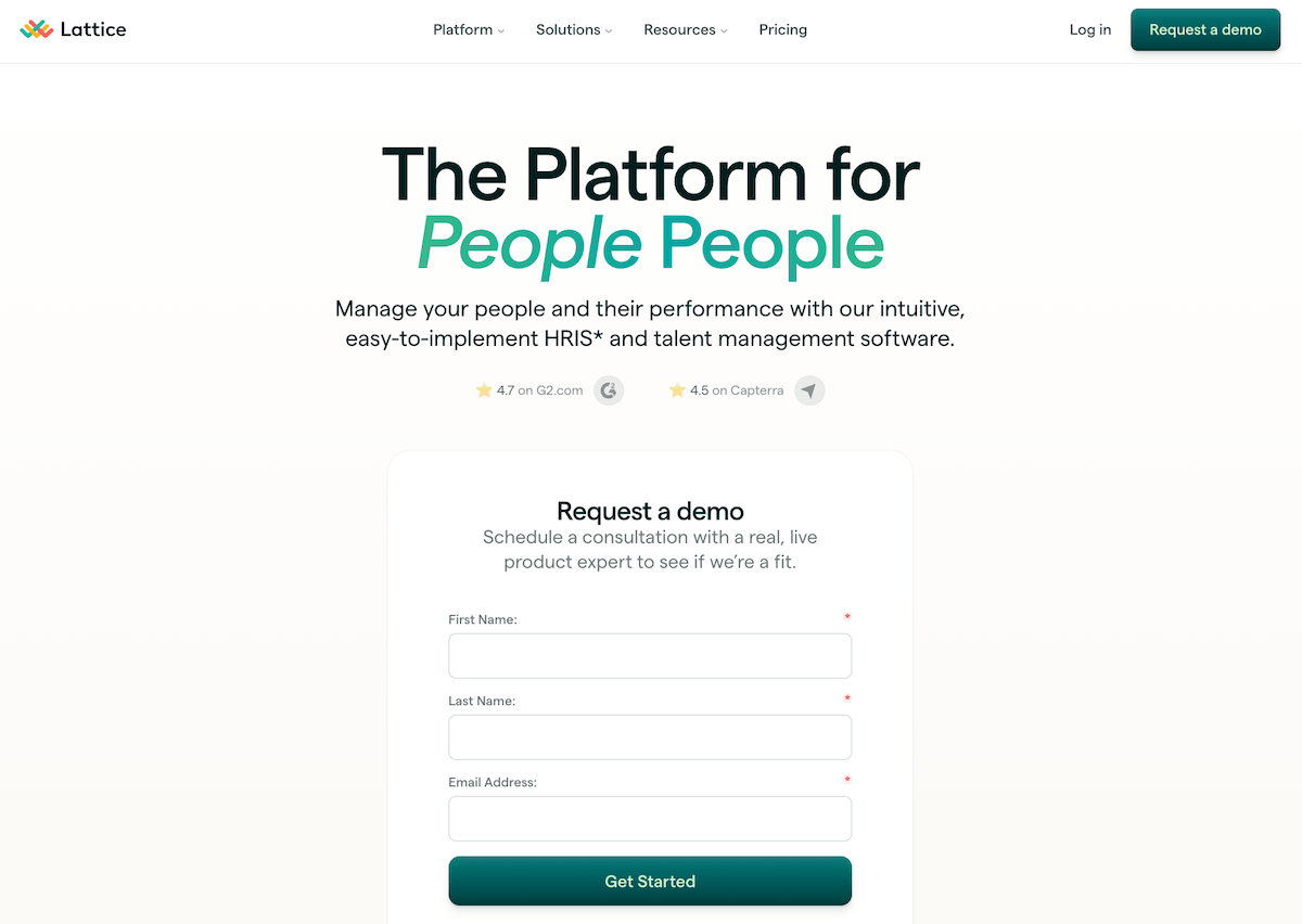
HR-specializing SaaS company Lattice demonstrates the power of simplicity with their WordPress landing page design. The landing page features just one headline (with subtly varying fonts and styling), plus a sub-headline copy block outlining the premise of the platform, and social proof with star ratings from G2 and Capterra.
After that, the eyes naturally draw towards the ‘Request a demo’ form, which features just three, easy-to-fill fields asking for the user’s name and email address. This is an effective landing page for driving demo requests because it touches on all the necessary elements of good landing pages without overloading the user with information.
Lead Generation Example #2: Webinar Registration Page (Search Engine Journal)
This WordPress-made landing page from SEO blog Search Engine Journal encourages users to sign up for a free webinar with:
- Bold copy: The title “Beyond ROAS: Aligning Google Ads With Your True Business Objectives” directly addresses a common concern among marketers.
- ‘Trust’ tick visuals.
- A clearly stated time and place to incite FOMO.
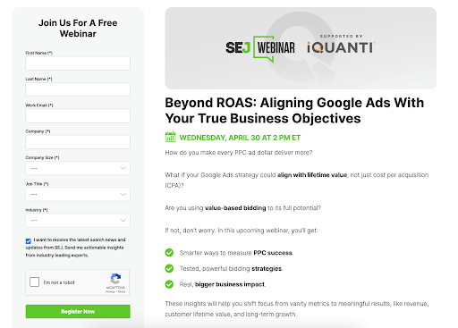
The webinar landing page includes a straightforward sign-up form, where users only have to leave a few details to gain access to the webinar. Scrolling further, you will also see a list of key takeaways from the seminar, demonstrating the benefits of signing up.
Lead Generation Example #3: Resource Download Page (Kinsta)
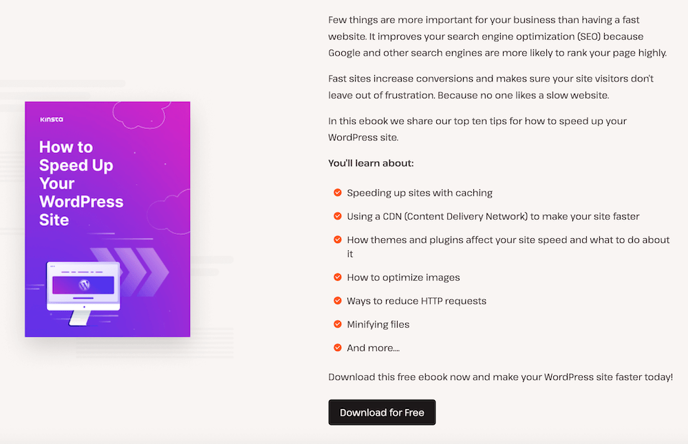
This eBook download page on the WordPress site Kinsta implements an eye-catching headline that describes the resource, coupled with sleek imagery, and a list of actionable areas of knowledge that readers will learn from downloading the eBook.
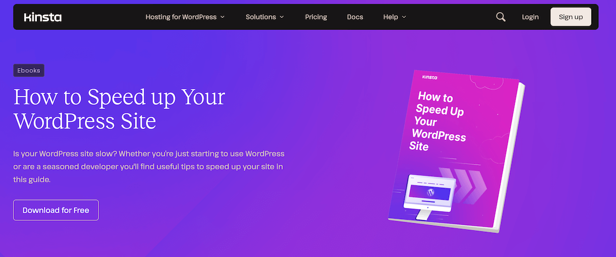
Right from the headline, the page addresses a common pain point: slow WordPress sites. This is something every WordPress site owner should be conscious of, making it a popular topic. The “Download for Free” button is then strategically placed at multiple points, ensuring that visitors can easily access the ebook regardless of where they are on the page.
Course, Membership, and Personal Brand Landing Pages
Online Course Example (Katalon Academy)
This online course landing page from Katalon Academy has a clear, compelling value proposition (i.e., enhancing software delivery through BDD).
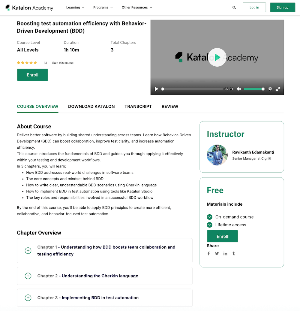
By offering the course for free and specifying its duration (1 hour and 10 minutes), the course provider (Katalon Academy) sets clear expectations and makes it easy for the user to enroll. It also has prominent ‘Enroll’ buttons and clear section headings to guide users easily through the page.
The page allows users to see the detailed subtopics within each course chapter, including their precise durations, meaning learners can gauge the time commitment needed and navigate the page content efficiently. Another motivating factor is the Lifetime Access granted with enrollment.
Membership Site Example (Brand.Me)
Brand.Me, a site that helps its members with their personal branding on social media, features a sleek landing page that focuses on the benefits of using the service. There’s a strong focus on the target audience: by stating ‘Who uses Brand.Me’, it appeals to individuals looking to enhance their personal brand.
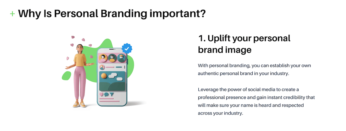
This structured, benefit-oriented structure makes it more likely the user will be convinced to sign up to the service as they scroll through the page, at which point they’re presented with pricing options and striking CTAs with a strong contrasting color.
Personal Brand Example: Mark Manson
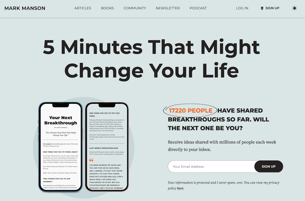
Mark Manson, a writer who gives life advice, bases his personal brand around changing people’s lives through actionable, science-based life advice. His landing page features strong social proof and FOMO techniques (17220 people have shared their breakthrough so far) and a compelling value proposition (to literally change your life).
There are prominent links to articles, podcasts, videos, and courses that allow users to easily explore various content formats, catering to different preferences and enhancing UX. It also includes a snapshot of Mark and his approach, making the concept more relatable. In this sense, this page is a great example of how a landing page can be utilized as a vehicle for a personal brand.
Ecommerce and SaaS Landing Pages that Drive Sales
Ecommerce Example #1: Digital Product Page (Valhalla DSP)
The product launch landing page for music production plugin Valhalla Delay places the name of the product in large bold text, with the pricing the second most prominent feature. The subtitle sums up the product succinctly, and this is all followed by the copy, which is minimal and describes the product in just a few sentences.
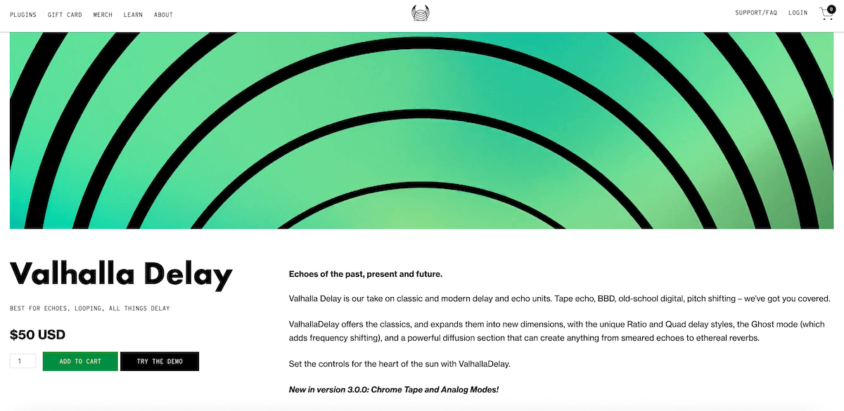
It also features prominent ‘Add to Cart’ and ‘Try the Demo’ buttons, all made within WordPress/WooCommerce. Overall, it is a simple yet eye-catching landing page.
Ecommerce Example #2: Service Page (Printing New York)
The Printing New York landing page for banner printing employs an eye-catching colour scheme, large descriptive headline copy placed side-by-side with a hero image, and product images for the different banner printing product categories that they offer.
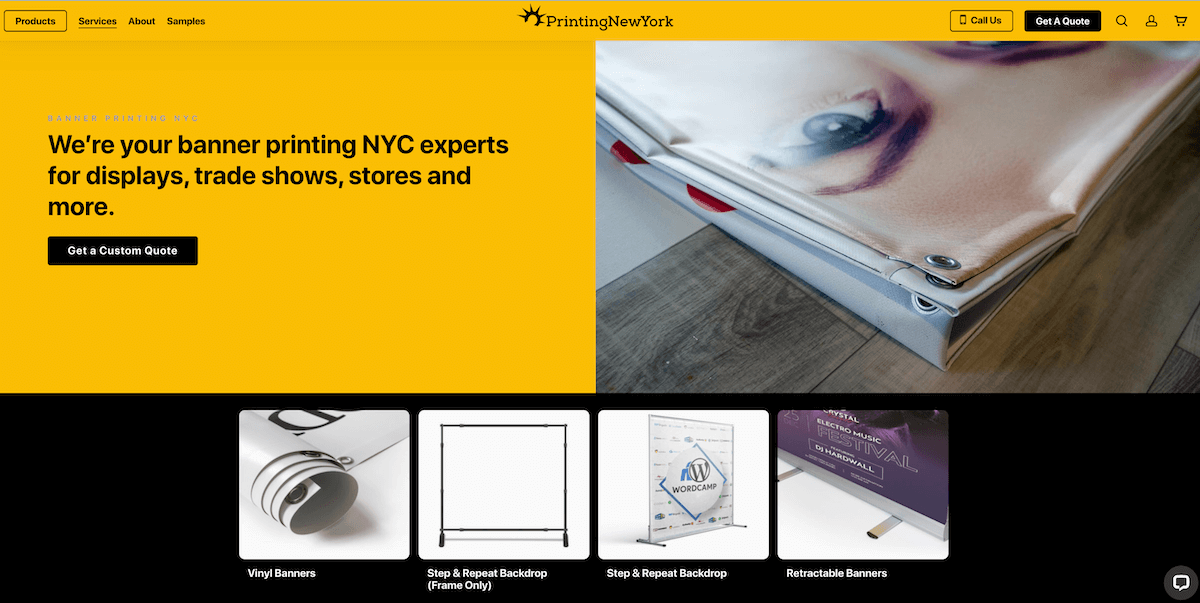
This makes it particularly effective as an example of an ecommerce landing page, which should focus on the unique characteristics and selling points of the product before anything else (rather than long copy or numerous text-based blocks).
The strong contrasting colors not only create an eye-catching visual but also make the CTA buttons stand out. Visitors to the page can clearly see their options, making it easy to contact the company or request a quote.
How FooConvert Transforms Your WordPress Landing Pages
FooConvert is a WordPress plugin offering conversion-focused widgets (popups, flyouts, and bars) that complement any landing page, helping you to increase your conversion rates. FooConvert integrates seamlessly with popular WordPress page builders and themes, making it compatible with any of the landing page examples discussed earlier.
The plugin allows you to build multiple widgets, of which there are three main types:
- Popups (appearing in the center of your screen)
- Flyouts (showing on either the left or right of the screen)
- Bars (for the top or bottom of the screen)
There are multiple trigger options available for each widget; for example, popups, flyouts, or bars can be displayed when a user signals an intent to exit the page or scrolls past a certain point. These can be strategically implemented to capture visitor attention at optimal moments and placed on specific pages or posts. This allows you to target a set audience to improve your chances of converting visitors.
FooConvert has real-time analytics capabilities that allow you to see which widgets and triggers are performing best on your site, directly within the WordPress dashboard. You can track clicks, views, conversions, the sentiment towards the widget, and more. The analytics will also track when changes are made to the widget, so you can assess the success of your changes, and adjust accordingly.

FooConvert is completely mobile-responsive, meaning conversion elements work effectively across all devices. If you want to elevate your landing pages, use FooConvert to drive your conversions.
Start Creating High-Converting Landing Pages Today
In this article, we’ve given you 10 actionable examples of how you can adapt your landing pages for your specific audience and business needs. Whether you’re looking to increase sign-ups or sales, or generate interest in your personal brand, your landing page is a critical point of contact.
FooConvert’s conversion widgets (popups, flyouts, and bars) can enhance any WordPress landing page, such as the ones featured here. With strategic calls-to-action, well-timed triggers and promotional elements, you can leverage FooConvert to get more leads and conversions.
Try FooConvert’s 7-day free trial to upgrade your new landing page designs today.
The Best WordPress Conversion Plugin
FooConvert is an easy-to-use WordPress conversions plugin, draw attention, increase sales and engagement.