

WordPress gives you several ways to resize images: choose a generated image size, change how an Image block displays, crop or scale an attachment in the Media Library, adjust sitewide Media Settings, or use gallery controls for thumbnail output. These workflows do different jobs, depending on what you need, so this guide shows when to use each one and what actually changes.
WordPress Image Resizing Options at a Glance
You can use the workflow below based on what you want to change: the stored attachment, one block on one page, future generated sizes, or gallery thumbnail output.
| Workflow | What changes | Best for | Watch-outs |
|---|---|---|---|
| Media Library edit | Attachment-level crop, scale, rotate, and image metadata. See WordPress Edit Media. | Fixing one uploaded image after it is already in the Media Library. | Edits may not solve every generated-size or cache issue. Test the front end after saving. |
| Image block settings | The selected image resolution and how the block displays. See the WordPress Image block docs. | Adjusting one image inside a post, page, or template. | Width, height, and crop controls can be display-focused. Do not assume they reduce the original file. |
| Settings > Media | Default image dimensions WordPress uses when adding images to the Media Library. See Media Settings. | Changing sitewide defaults for future uploads. | Existing uploads usually need regenerated thumbnails if you want old attachments to use new sizes. |
| Plugin or gallery controls | Gallery thumbnails, templates, and layout-specific image output. | Keeping many gallery images consistent without resizing each one manually. | Gallery thumbnail controls are not a substitute for optimizing large original uploads. |
Note
Watch out
Display size is not always file size
Changing the width or height of an image in the editor can change how it appears on the page, but it does not always replace the uploaded original. To reduce what visitors download, also choose an appropriate generated size, edit the attachment, optimize the file, or rely on WordPress responsive image output.
Key
Tested setup
Tested with WordPress 7.0 in WordPress Playground
This guide was checked against a fresh WordPress Playground install on June 28, 2026. The default Media Settings were thumbnail 150 x 150 cropped, medium max 300 x 300, large max 1024 x 1024, and uploads organized into year/month folders. Your site can differ if your theme, plugins, or Settings > Media values have changed.
Current WordPress Defaults for Image Sizes
In a fresh WordPress 7.0 Playground install, you’ll see that Settings > Media shows three core size settings: thumbnail, medium, and large. WordPress uses these settings when it creates intermediate image files after upload. Themes and plugins can add extra registered sizes, so a production site may have more than the three defaults.
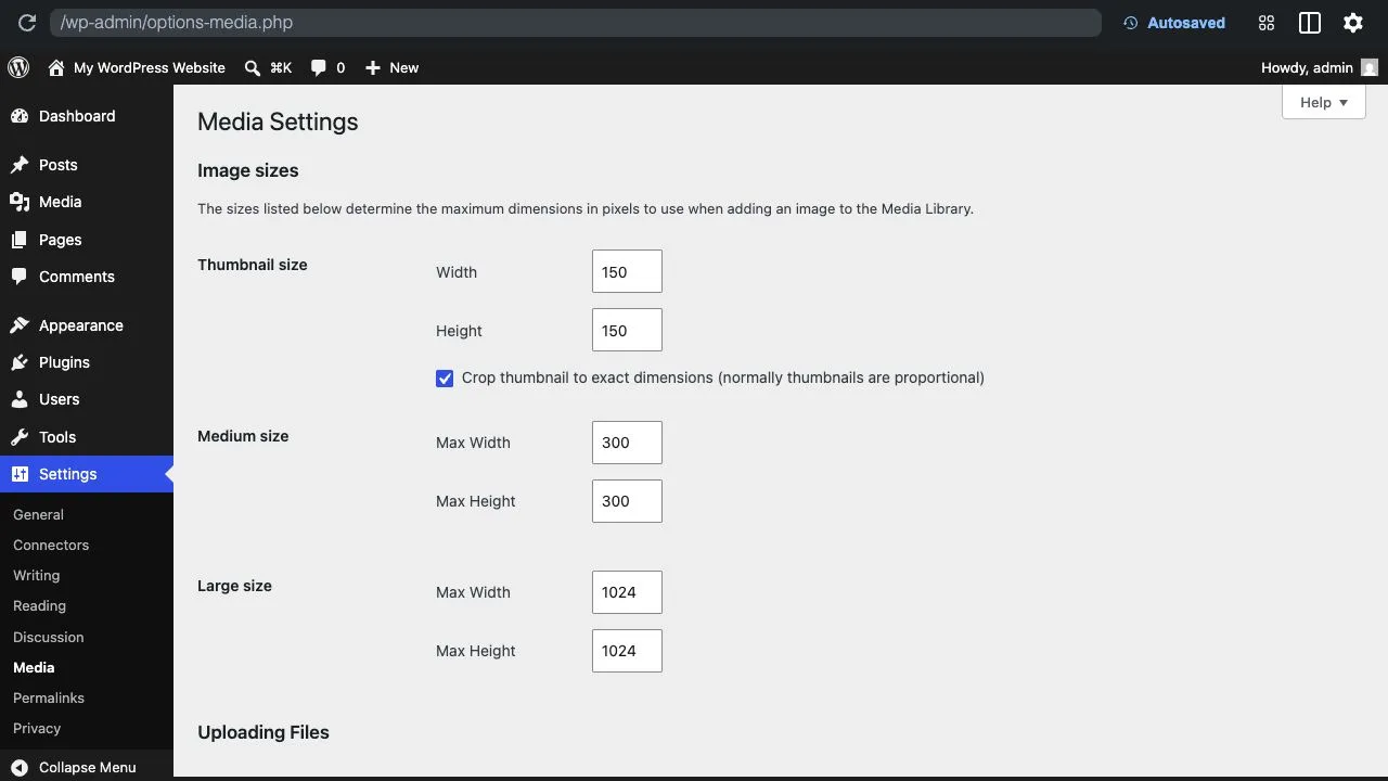
The default values are:
- Thumbnail: 150 x 150 pixels, cropped to exact dimensions.
- Medium: maximum width 300 pixels and maximum height 300 pixels.
- Large: maximum width 1024 pixels and maximum height 1024 pixels.
For broader background on how sizes work, see our guide to WordPress image sizes. WordPress also outputs responsive image markup for many images, which helps browsers choose an appropriate file from the available sizes. (The official Responsive Images API explains the underlying behavior, if you want to look into this further.)
How to Resize an Image in the WordPress Editor
If you only need to change one image in one post or page, you can use the WordPress Editor. Select the Image block, then use the block toolbar and sidebar controls to choose an image size, adjust alignment, crop, change aspect ratio, or set display dimensions.
- Open the post or page that contains the image.
- Select the Image block.
- Use the block settings sidebar to choose the image resolution or adjust display dimensions.
- Use the Crop control when you need to change framing or aspect ratio for that block.
- Preview the page on desktop and mobile before publishing.
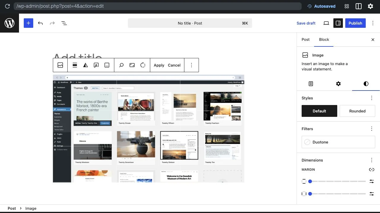
This is the fastest workflow for editorial layout fixes, but not the best if your real problem is that the uploaded file is too large. For that, use a generated image size, attachment edit, or optimization workflow.
How to Resize an Uploaded Image in the Media Library
Use the Media Library when the attachment itself needs a crop, scale, or rotation edit. To do this in WordPress 7.0, open Media > Library, select the image, choose Edit Image or Edit more details, and use the available crop, scale, rotate, undo, redo, cancel, and save controls.
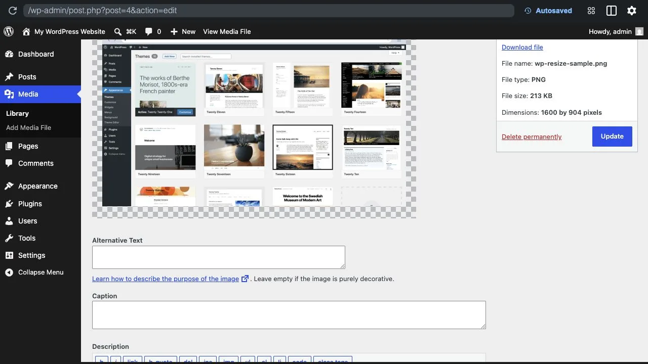
The Media Library workflow is useful for fixing a single image that is already used in multiple places. After editing, clear page caches and check the pages where the attachment appears, because cached thumbnails or CDN versions can make an old image appear temporarily.
How to Change Image Sizes Sitewide
The default thumbnail, medium, and large image dimensions are controlled in Settings > Media controls. These are used for future uploads though, so if you change these settings on an established site, WordPress won’t automatically rebuild every existing image file. You will usually need to regenerate thumbnails with a trusted image regeneration plugin or deployment workflow.
WordPress can also scale very large uploaded images. The core big_image_size_threshold filter documents the default threshold behavior and how developers can customize it. If you are troubleshooting unexpected filenames such as -scaled, this is the WordPress behavior to check first.
Resize Images for Performance, Not Just Layout
Image resizing is only one part of image performance. A page can still be slow if it loads the wrong file type, oversized originals, weak compression, missing lazy loading, or too many images above the fold. Start with what you need for the visible display, then make sure the file delivered to visitors is appropriately sized and compressed.
For performance-specific workflows, read our guides to website image optimization, common WordPress image optimization mistakes, and responsive images in WordPress.
Older advice often says WordPress always compresses JPEGs to one fixed quality number. That is no longer a safe way to explain current behavior. WordPress exposes the wp_editor_set_quality filter, and the final output can also depend on your image editor library, file type, optimization plugin, CDN, and hosting setup.
Resizing vs Cropping: Which Should You Use?
Resize when you want the whole image to appear smaller or use a more appropriate generated size. Crop when the composition or aspect ratio needs to change.
Pros
What resizing does well
- Preserves the full composition when the whole image still matters.
- Can reduce displayed dimensions and help match a layout.
- Works well with responsive image sizes when the right file is selected.
Cons
What resizing cannot fix
- Display-only resizing may still load an oversized original file.
- Reducing dimensions too far can make important detail look soft.
- Sitewide size changes usually need thumbnail regeneration for existing uploads.
Cropping has the opposite tradeoff: it is better for framing and aspect ratio, but it removes part of the original image. Use it deliberately when the image needs a different composition, such as a square thumbnail, a portrait crop, or a tighter product detail.
Where Gallery Controls Fit
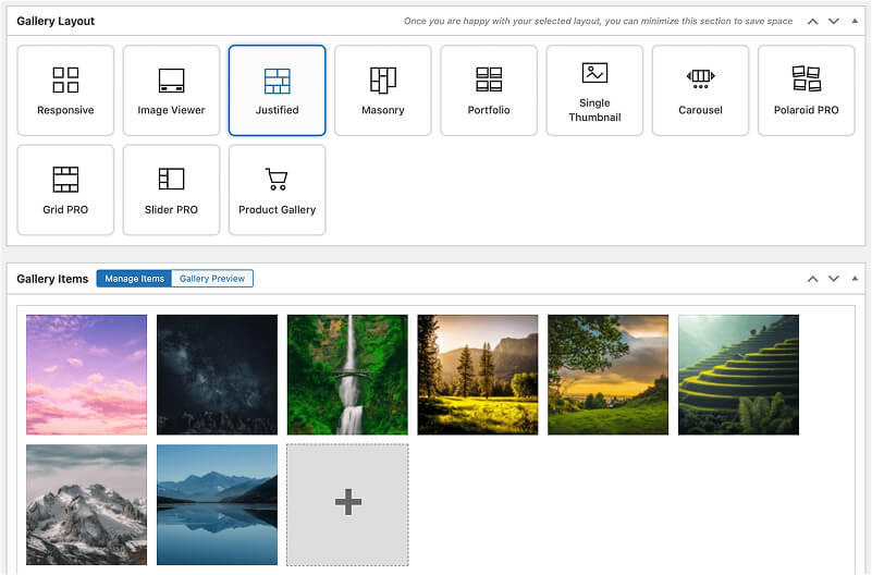
If your site uses image galleries, a plugin like FooGallery can handle gallery-level thumbnail sizing, templates, and responsive gallery layouts so you do not have to resize images to fit the layout. Instead, you set the thumbnail dimensions for your gallery layout, and images conform to these settings. Full-size images will still open in the lightbox of the gallery.
This is a particularly useful solution if you have a variety of images in different sizes, and resizing or cropping won’t work. As FooGallery has a number of different layouts, you can find an option that works best with your images. For example, a masonry or justified gallery keeps image dimensions and fits images into rows or columns accordingly, removing the need for any cropping. Here’s a screenshot of how the justified gallery does this:

Using a gallery plugin therefore gives you more control over image sizes and how media is displayed within your galleries. It also means that users can still see the uncropped, full-size images within the gallery lightbox. However, this also means that large images aren’t resized within the gallery, which couold impact performance. As such, image optimization is still a critical step in this workflow.
To reiterate, this distinction matters: gallery controls are best for consistent gallery output, while image optimization is still important for original uploads. If you are building a gallery-heavy site, start with our WordPress gallery guide, then review the FooGallery plugin page for templates, responsive layouts, and gallery-specific controls.
FooGallery Ownership Disclosure
FooGallery is owned and maintained by FooPlugins. When we mention or recommend FooGallery in this article, that relationship may influence how the product is covered; product details should be checked against current documentation, demos, pricing, and release notes.
For WooCommerce or product-heavy galleries, FooGallery PRO Commerce also includes gallery features designed for product displays. Use Gallery Blueprints when you want a reusable gallery configuration that can be applied across multiple galleries.
FooGallery WordPress gallery plugin
The Best WordPress Gallery Plugin
FooGallery is an easy-to-use WordPress gallery plugin with stunning gallery layouts and a focus on speed and SEO.
Recommended Workflow for Resizing Images in WordPress
When it comes to resizing images, there isn’t a one-size-fits-all solution. The method you use will depend on your needs, but for an optimal workflow, we recommend the following:
- Upload images that are already reasonably sized for the content they support.
- Use Settings > Media to keep future generated sizes aligned with your design.
- Use Image block controls for one-off layout and crop changes.
- Use Media Library edits for attachment-level fixes.
- Use gallery controls for gallery thumbnails and layouts, especially when cropping or drastically resizing is unwanted.
- Use an optimization plugin or CDN workflow to keep delivered file sizes under control.
For most WordPress sites, the right answer is a mix of these workflows. Use WordPress defaults and responsive images for normal editorial content, edit individual attachments when a file needs correction, and use gallery controls when a large set of images needs consistent output. For this, try FooGallery – it gives you the settings and layouts you need for more advanced control over your media sizes.
Sources checked: WordPress Media Settings, WordPress Image block, WordPress Edit Media, the Responsive Images API, big_image_size_threshold, and wp_editor_set_quality. Last checked June 28, 2026.